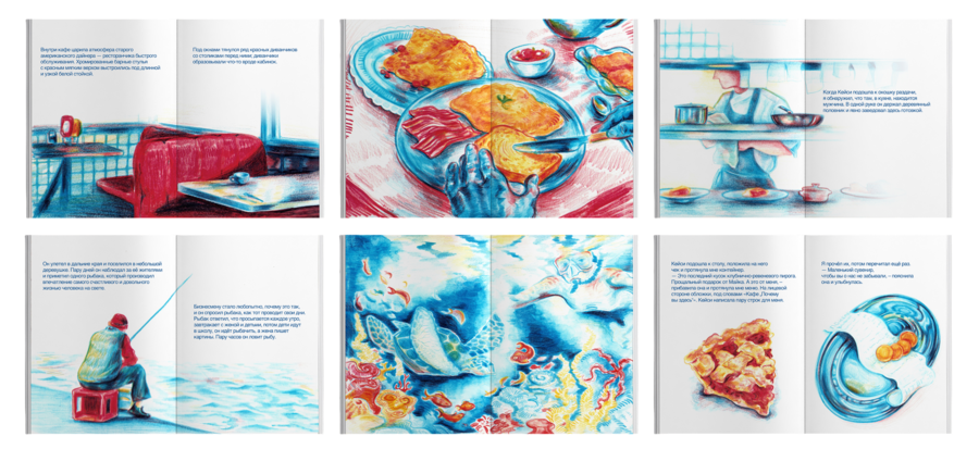
На арт-практике я иллюстрировала книгу Джон Стрелеки «Кафе „Почему ты здесь?“». Для создания фирменного стиля за основу были взяты иллюстрации, а также атмосфера и сюжет самой книги.
Бренд
WHY CAFÉ
— уютное кафе, вдохновлённое книгой Джона Стрелеки «Кафе „Почему ты здесь?“». За чашкой кофе можно отвлечься от повседневной суеты и подумать о экзистенциальных вопросах. Тёплая атмосфера, эстетика американских дайнеров 1960–70-х годов и лёгкая ностальгия создают пространство для неспешных разговоров и времени наедине с собой.Процесс генерации изображений
В процессе создания изображений в основном использовался референсный и итеративный промптинг. Сначала я формировала визуальную концепцию, подбирала референсы и описывала свои идеи чату, он помогал переводить их в подробные англоязычные промпты. При необходимости я самостоятельно дополняла и уточняла запросы, конкретизируя композицию, ракурс, материалы, освещение и стилистику. Для сохранения единства айдентики в промптах закреплялись точные HEX-коды, типографика логотипа, материалы, характер освещения и обработки кадра. Благодаря этому изображения интерьера, упаковки, посуды, одежды и рекламных материалов сохраняли общую стилистику. Затем последовательно корректировала результаты с помощью уточняющих промптов, изменяя отдельные детали и сохраняя удачные элементы. Готовые генерации также использовались как референсы для создания новых изображений и мокапов.
Последовательность работы
На первом этапе я сформировала визуальную концепцию и собрала референсы, определяющие архитектуру, предметную съёмку, материалы и настроение бренда.
Затем были созданы основные изображения кафе (интерьер, фасад, предметные композиции с едой и напитками). Эти изображения сформировали визуальную среду проекта и стали основой для последующих генераций.
Следующим этапом стала разработка носителей айдентики: меню, упаковки, посуды, одежды персонала, полиграфии и рекламных материалов. Для этого использовались уже полученные изображения, графические референсы и промпты, подробно описывающие способ нанесения дизайна на реальные поверхности.
После этого создавались более сложные композиции, в которых ранее сгенерированные фотографии использовались повторно. Например, готовые изображения еды и напитков становились основой рекламных постеров, размещённых на витринах и в интерьере кафе.
Константы
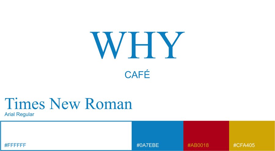
Я определила основные характеристики изображений: ретромодернизм 1960–1970-х годов, эстетика европейских кафе и американских дайнеров, предметная и архитектурная фотография, естественное освещение, плёночная зернистость и реалистичные фактуры материалов. Для сохранения целостности проекта использовалась фиксированная палитра — голубой 0A7EBE, красный AB0018, жёлтый CFA405 и белый, шрифтовая пара — Times New Roman и Arial regular
Пространство
Photorealistic architectural editorial photograph of WHY Café’s exterior, directly based on the provided interior reference. The facade is a natural continuation of the same 1960s–1970s European retro-modernist architecture, materials and restrained color palette.
Ground-floor café integrated into an older European urban building. Wide floor-to-ceiling storefront windows with softly rounded corners, dark metal frames, pale blue square ceramic tiles, curved entrance, brushed stainless steel, ribbed glass, glass-block details and aged stone pavement. Horizontal warm ivory illuminated glass panels above the storefront, echoing the interior lighting.
Minimalist signage: «WHY» in a classic Times New Roman-style serif, with much smaller «CAFÉ» underneath. Precisely proportioned lettering integrated into the facade, without additional decoration.
Signature colors: blue 0A7EBE in ceramic tiles, deep red AB0018 in leather seating, mustard yellow #CFA405 in subtle interior accents, balanced with warm ivory, white and chrome. Through the windows, a curved blue-tiled counter, red leather seating, stainless steel furniture and vintage porcelain tableware are partially visible.
Strictly frontal, perfectly straight-on architectural photograph, taken from across the street at eye level. Camera perpendicular to the facade, straight vertical and horizontal lines, no diagonal perspective or visible side walls. Complete storefront, entrance and signage within the frame. Balanced geometry, subtle symmetry, realistic proportions and minimal urban surroundings.
Soft natural daylight, gentle reflections, warm interior lighting, quiet atmosphere without people. Authentic 1970s archival photography on 35 mm color negative film: organic grain, optical softness, faded desaturated colors, low contrast, subtle yellow-green undertones, delicate haze and imperfect exposure.
Timeless European modernist aesthetic, realistic materials and understated elegance. Avoid CGI, HDR, digital sharpness, neon, oversized signage, excessive decoration, contemporary storefront clichés and dramatic color grading. Horizontal 3:2 composition.
Photorealistic architectural photograph of WHY Café, combining 1960s–1970s European retro-modernism, subtle American diner influences and the atmosphere of a forgotten modernist architectural gem. Quiet, sophisticated, timeless interior with the understated elegance of vintage European cafés and art-house cinema.
Distinctive modernist architecture with rounded corners, curved partitions, long sculptural counters, small glossy ceramic tiles, ribbed glass, glass blocks, brushed stainless steel, chrome, lacquered wood, vintage leather and tubular steel furniture. Balanced geometric precision and organic curves, generous open surfaces, subtle asymmetry and minimal decoration.
Restrained use of WHY Café's signature colors: blue 0A7EBE in tiles and architectural details, deep red AB0018 in seating, mustard yellow #CFA405 in tabletops, balanced with white and warm neutral surfaces. Discreet WHY wordmark in a classic Times New Roman-style serif, naturally integrated into the interior.
Soft diffused daylight, gentle shadows, subtle reflections and warm vintage lighting. Almost empty café with a few porcelain cups and simple glassware. Calm, intimate, slightly melancholic atmosphere.
Authentic expired 35 mm color negative film photography: visible grain, optical softness, slightly blurred edges, low contrast, muted faded colors, warm yellow-green undertones, delicate haze and imperfect exposure. Nostalgic aesthetic of a 1970s architectural magazine.
Editorial architectural composition, frontal or slightly angled perspective, strong geometry, generous negative space, realistic materials and proportions. Avoid CGI, HDR, digital sharpness, oversaturation, contemporary boutique aesthetics, excessive decoration, neon, dramatic color grading and artificial perfection.
Photorealistic cinematic architectural editorial photograph of the kitchen serving window inside WHY Café, directly inspired by the provided original colored-pencil illustration. Reinterpret the illustrated scene as a believable real architectural space while preserving its essential composition: a simple rectangular kitchen serving hatch, a partially visible café cook in a white uniform working behind the opening, a few freshly prepared breakfast plates on the serving counter, and hanging glasses and kitchen utensils visible above. The kitchen is integrated into a sophisticated 1960s–1970s retro-modernist café interior with small glossy pale blue ceramic tiles, stainless steel countertops, rounded architectural corners, warm ivory walls and understated vintage functional details. Restrained accents of the exact WHY Café signature colors: blue 0A7EBE, deep red AB0018 and mustard yellow #CFA405. The scene feels authentic, slightly worn, quiet and naturally lived-in, with no exaggerated retro decoration. Carefully framed frontal composition, strong architectural geometry, subtle asymmetry and generous negative space. The cook is partially obscured by the architecture, appearing as a natural part of the everyday scene rather than posing for the camera. Soft natural daylight mixed with warm kitchen lighting, delicate reflections on metal and ceramic, gentle shadows. Photographed on vintage 35 mm color negative film, visible organic grain, slightly faded colors, gentle optical softness, subtle photographic haze, subdued contrast and the imperfect atmosphere of a 1970s architectural magazine photograph. Quiet, nostalgic, cinematic and art-house, like a still frame from an old European film. Real photography, not an illustration, no CGI, no contemporary industrial kitchen aesthetic, no excessive props, no oversaturation, no artificial sharpness, no text. Vertical 4:5 composition.
Кейвизуалы
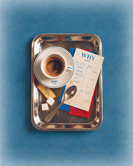
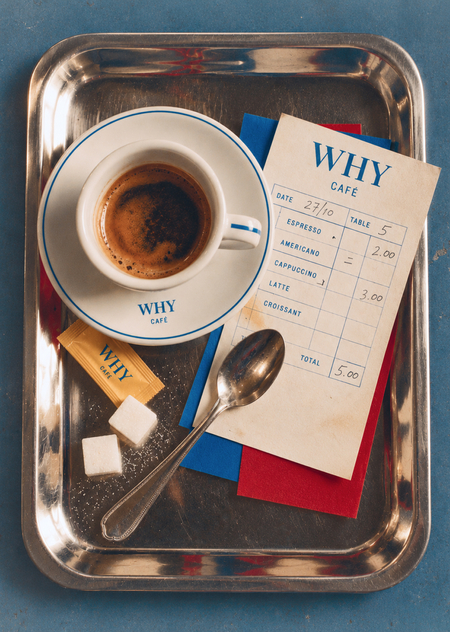
- Photorealistic vintage editorial still life of WHY Café. Perfectly vertical 90-degree overhead flat lay. A rectangular vintage stainless steel serving tray with softly rounded corners, worn reflective edges and subtle scratches, centered on a textured dusty blue background. Generous negative space surrounding the tray, with slightly more space above and below.
On the upper-left side, a small white porcelain espresso cup filled with dark coffee and golden-brown crema, resting on a matching saucer. Both have delicate thin blue rims. The cup handle points right, with a small blue stripe. The saucer features the blue serif «WHY» logo with smaller «CAFÉ» underneath.
On the right, a slightly tilted ivory paper receipt with a large blue «WHY» serif wordmark, small «CAFÉ» beneath and a fine blue printed grid listing coffee orders, handwritten numbers and prices. The receipt overlaps two rectangular paper sheets, one saturated blue 0A7EBE and one deep red AB0018, partially visible underneath.
A vintage stainless steel teaspoon lies diagonally across the lower center, its handle pointing toward the bottom-left corner. Two white sugar cubes with scattered sugar crystals sit beside a mustard-yellow #CFA405 sugar packet printed with the blue WHY logo.
Realistic scratched metal, aged ivory paper, glossy porcelain, dark espresso and matte textured blue surfaces. Soft neutral daylight from the upper left, gentle natural shadows and warm metallic reflections.
Authentic 1970s European café editorial photography on expired 35 mm color negative film. Visible organic grain, subtle optical softness, slightly faded colors, low microcontrast, delicate film haze and natural imperfections. Nostalgic, tactile and understated atmosphere.
Strictly preserve the reference image’s arrangement, scale, spacing and typography. No additional objects, CGI, digital sharpness or excessive saturation. Vertical 4:5 composition.
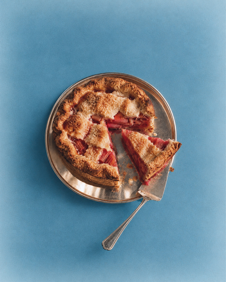
- High-end conceptual editorial food photography for WHY Café, inspired by experimental 1970s European still-life photography, vintage fashion editorials and retro-modernist visual culture. A freshly baked rhubarb pie with a golden, slightly irregular flaky pastry crust and visible deep pink-red rhubarb filling. One generous triangular slice is cut from the pie and placed at an unexpected sculptural angle, with a vintage stainless steel cake server leaning diagonally against it. The pie sits on a simple reflective silver serving plate against a muted dusty blue background, visually connected to the WHY Café signature blue #0A7EBE. Tight, carefully cropped composition, strong geometric relationships between the triangular slice, round pie and diagonal metal utensil. Emphasis on tactile pastry texture, natural imperfections, reflective stainless steel and sculptural food arrangement. Directional studio daylight creates strong but soft-edged shadows and subtle metallic reflections. Authentic vintage 35 mm color film photography, fine visible grain, slight optical softness, naturally faded colors, subdued contrast, gentle analog haze and imperfect photographic texture. Sophisticated, quietly surreal, nostalgic and understated, like an experimental food photograph from a 1970s art magazine. No CGI, no artificial food styling, no excessive props, no modern bakery advertising, no glossy digital sharpness, no text or typography. Vertical 4:5 composition.
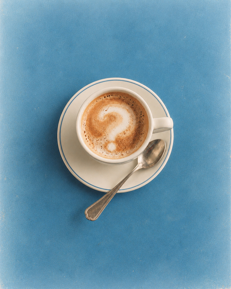
- Minimalist conceptual editorial product photograph for WHY Café, inspired by sophisticated 1960s–1970s European café photography and retro-modernist still-life compositions. Strict overhead close-up of a single white porcelain cappuccino cup resting on a matching saucer, placed on a smooth matte blue tabletop in the WHY Café signature color #0A7EBE. The cappuccino has rich warm caramel-colored crema and a delicate, imperfect question mark formed naturally from white steamed milk foam. The question mark must look like genuine handmade latte art, slightly blurred, soft-edged, organically irregular and partially dissolving into the coffee surface, not a digitally drawn symbol, not a perfectly sharp or graphic icon. The white foam blends naturally into the brown crema with subtle feathering and tiny bubbles. A small vintage stainless steel teaspoon rests diagonally across the saucer. Extremely restrained composition, generous negative space, elegant circular geometry and carefully controlled asymmetry. Soft directional afternoon sunlight, delicate porcelain reflections, subtle shadows. Authentic vintage 35 mm color film photography, fine visible grain, slight optical softness, muted and naturally faded colors, low contrast, gentle analog haze and imperfect photographic texture. Intimate, poetic, nostalgic and sophisticated, like a quiet frame from a 1970s European art-house film. No CGI, no artificial foam graphics, no perfect question mark, no contemporary coffee advertising, no excessive props, no digital sharpness, no text. Vertical 4:5 composition.
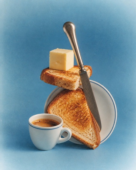
- Experimental conceptual editorial still-life photograph for WHY Café, inspired by avant-garde 1970s European food photography, sculptural object compositions and retro-modernist art direction. A carefully balanced, slightly surreal vertical assemblage of authentic café objects: several white porcelain saucers, a small white espresso cup, polished stainless steel serving dishes, a vintage metal butter dish, two pieces of golden toast, a small silver spoon and a simple glass dessert bowl. The objects are stacked and interlocked in an unexpected but physically believable sculptural arrangement, creating a striking composition of circles, diagonals, reflective metal and ceramic surfaces. The construction is visually elegant, minimal and slightly absurd, yet composed entirely of recognizable everyday café objects. Clean dusty blue studio background, connected to the WHY Café signature color #0A7EBE, with natural muted cream and silver tones and small warm yellow accents. Frontal studio composition with generous negative space, strong geometric balance and subtle imperfections. Soft directional lighting creates delicate shadows and sophisticated reflections across the metal and porcelain. Authentic vintage medium-format analog film photography, fine organic grain, gentle optical softness, slightly faded colors, subdued contrast, subtle film haze and tactile photographic texture. Feels like an experimental 1970s European fashion editorial or an art-house magazine still life, quietly luxurious, nostalgic and visually unexpected. No CGI, no floating objects, no impossible physics, no decorative clutter, no modern commercial product advertising, no text, no excessive saturation. Vertical 4:5 composition.
Create a highly realistic editorial product photograph identical to the provided reference image, preserving its exact composition, camera angle, perspective, proportions, materials, typography and lighting.
Composition: Four identical narrow rectangular WHY CAFÉ menus arranged side by side in a perfectly aligned diagonal row on a large brushed stainless steel countertop. Slightly elevated three-quarter camera angle, looking down at the menus. All four menus are parallel to each other and aligned with the front edge of the counter. The countertop forms a prominent geometric corner in the foreground, with a large empty metallic surface behind the menus. Tight, architectural composition, 4:3 landscape format.
Materials: Each menu is a very thin, rigid brushed aluminum plate with a subtle satin metallic finish, fine horizontal grain, delicate reflections and precisely cut straight edges. Minimal thickness, approximately 1–2 mm. No paper texture, no stacked sheets, no thick blocks. The menus lie completely flat against the countertop.
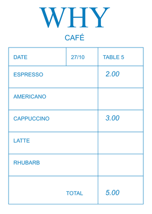
Preserve the exact blue #0A7EBE typography and fine receipt-style table layout. Each menu has a small header reading «DATE | 27/10 | TABLE 5», followed by a bold uppercase category title and a structured table of dishes and right-aligned prices. Use clean Arial-style sans-serif typography, thin blue grid lines and precise spacing.
The four menus contain:
1. COFFEE — Espresso, Americano, Cappuccino, Latte, Flat White, Iced Americano, Iced Latte, Matcha Latte, Hot Chocolate.
2. BREAKFAST — Croissant, Pain au Chocolat, Banana Bread, Yogurt & Granola, Egg Sandwich, Avocado Toast.
3. LUNCH — Soup of the Day, Salad Niçoise, Grilled Cheese, Chicken Sandwich, Quinoa Bowl, Tartine.
4. DESSERT — Seasonal Pie, Chocolate Cake, Vanilla Flan, Cheesecake, Carrot Cake, Tiramisu, Ice Cream, Affogato, Madeleine.
At the bottom of each menu, place one large blue Times New Roman-style serif word, forming the phrase «Why are you here?» across the four menus from left to right. Preserve the exact word placement, scale and typography of the reference.
Premium photorealistic architectural product photography, neutral diffused studio daylight, soft realistic shadows, subtle metallic highlights.
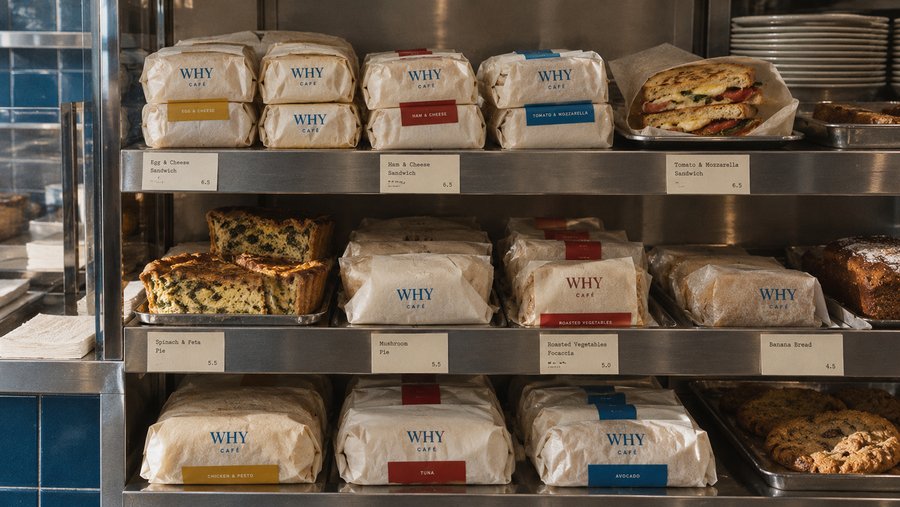
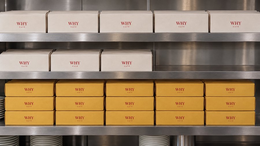
- Photorealistic editorial product photograph of neatly arranged WHY CAFÉ pastry takeaway boxes displayed on brushed stainless steel shelves inside a minimalist retro-modernist café inspired by European interiors of the 1960s–1970s. Perfectly frontal camera angle at eye level, tightly cropped horizontal 16:9 composition. Three wide horizontal stainless steel shelves occupy the entire frame, creating a clean architectural grid of repeated rectangular packaging. On the upper shelf, five identical warm ivory cardboard boxes arranged side by side in a perfectly straight row. On the middle shelf, three identical ivory boxes positioned on the left, leaving an intentionally empty metallic space on the right. On the lower shelf, fifteen mustard yellow CFA405 boxes arranged in three precisely aligned rows of five, creating a dense geometric pattern. All boxes have identical proportions, a low elongated rectangular shape, neatly folded cardboard flaps, subtle paper grain, realistic seams and a premium matte finish. Each box features a small, perfectly centered WHY CAFÉ wordmark printed in deep red AB0018 on its front-facing side. The logo consists of uppercase «WHY» in classic Times New Roman-style serif typography, with much smaller, widely spaced uppercase «CAFÉ» in Arial directly underneath. Maintain exactly the same logo proportions, size and placement on every box. The packaging design is extremely minimal, with no illustrations, additional text, patterns or decorative elements. The shelves are made of thick brushed stainless steel with realistic horizontal grain, soft reflections, subtle scratches and gently rounded edges. The background consists of stainless steel kitchen wall panels, with small glimpses of stacked white ceramic plates visible beneath the lowest shelf. Strong emphasis on repetition, symmetry, architectural geometry, material contrast and restrained graphic design. Neutral soft diffused ambient lighting, no direct sunlight, no harsh shadows or dramatic highlights. Slightly muted analog colors, fine 35 mm film grain, subtle photographic softness and authentic material textures. High-resolution professional editorial photography with a quiet, nostalgic yet contemporary atmosphere. No people, no food, no additional props, no excessive reflections, no CGI appearance, no artificial studio lighting, no stock photography aesthetic.