Wsafe — агенство белых хакеров. Бесконечный поток данных символизирует понятное каждому пользователю интернет-пространство.
Ребрендинг
Сначала Qwen Chat создал несколько пробных макетов, из которых я выбрала один, на основе которого далее создавался фирменный стиль.
Новой метафорой стало выделение текста
Chat gpt:
«Выделение позволяет выхватить важную информацию из бесконечного потока данных, изолировать её и направить на неё внимание. Для Wsafe этот жест становится метафорой работы этичных хакеров: обнаружения уязвимостей, выявления потенциальных угроз и определения того, что требует особого внимания.»
Chat gpt
1)Design a Wsafe wordmark logo using the existing typography and visual identity established in this project. Keep the exact same typeface and letterforms already used in the previous designs.
Keep the «W» black and place «safe» in white inside a vivid electric-blue rectangular text-selection highlight, as if the word were selected on a digital device. Add a thin vertical orange cursor-like line at the right edge of the blue rectangle.
Preserve the established typography, proportions, and minimalist visual style. Use an off-white background and the existing Wsafe brand colors. Keep the design flat, clean, and precise.
2)Create a monochrome version of this logo.
Для генерации палитры я использовала Qwen chat, потом определила цвета в фигме.Create a simple color palette for Wsafe, a white-hat cybersecurity agency. Use five colors: dark navy, vivid electric blue, light blue, bright orange, and off-white. Make the palette modern, clean, and high-contrast.
С помощью сайта whatthefont я определила шрифт
Он оказался максимально похож на Helvetica Now Pro Display ExtraBlack
Макеты
Chat gpt
Плакат:
Create a bold Wsafe cybersecurity poster in a wide horizontal 2:1 format. Use the slogan: «THREATS DON’T ALWAYS LOOK LIKE THREATS.»
Make vivid electric-blue text-selection highlights the main visual element. Highlight multiple words and entire sections of the headline, creating overlapping blocks of selected text. Use black typography, white text inside blue highlights, and tiny orange cursor accents.
Use the exact Wsafe brand colors.
Мокап:
Create a photorealistic mockup using the attached Wsafe poster as the exact artwork. Display it as a large-scale outdoor billboard against a beautiful, clear blue sky, photographed from a slightly low angle. The billboard should feel bold, monumental, and visually striking, with plenty of open sky around it.
Preserve the original poster design exactly. Minimal urban environment, bright natural daylight, clean composition, premium art direction, realistic materials and shadows. Focus on the contrast between the bold graphic poster and the open blue sky.
Chat gpt
Create a realistic laptop mockup displaying the website of Wsafe, a modern white-hat cybersecurity agency.
Use the exact brand colors. Design the website in a clean, minimalist editorial style. Use a white background, dark typography, vivid blue text-selection highlights, and small orange cursor accents. Include a bold headline: «Not all the hackers are the enemy.» Add a simple navigation bar, a short introduction about cybersecurity, and a clear call-to-action button. Show the website on a modern laptop viewed at a slight angle, against a neutral background. Professional branding presentation, realistic screen, precise typography, generous whitespace. Keep the design consistent with Wsafe’s visual identity.
Chat gpt
- Сначала я сгенерировала плакаты, у них был практически одинаковый промпт
Create an A4 portrait poster for Wsafe, a white-hat cybersecurity agency.
Main headline: «EVERY CLICK LEAVES A TRACE./YOUR SECURITY IS OUR PRIORITY.»
Arrange the headline in an asymmetric typographic composition. Highlight selected words with vivid electric-blue rectangles, using white letters inside the highlights. Include a small orange cursor line and a few tiny technical labels. Keep some words black on white to create contrast between selected and unselected text.
Brand colors. Minimal, contemporary, typography-driven design with precise alignment and generous whitespace. A4 vertical print format, flat poster artwork.
Затем мокап:
Create a photorealistic mockup featuring the two attached Wsafe cybersecurity posters displayed side by side on a vivid electric-blue brick wall. Poster placement: Display both posters vertically, side by side, mounted directly onto the blue brick wall without frames. The posters should be clearly visible and remain the main focus of the composition.
Lighting and photography: Soft directional daylight, realistic shadows between the posters and the brick surface, subtle texture, and high-end editorial architectural photography. Use a straight-on camera angle with a carefully balanced composition. The blue wall should create a bold, visually cohesive backdrop for the Wsafe identity. Preserve the original artwork: Use the two attached poster designs exactly as provided.
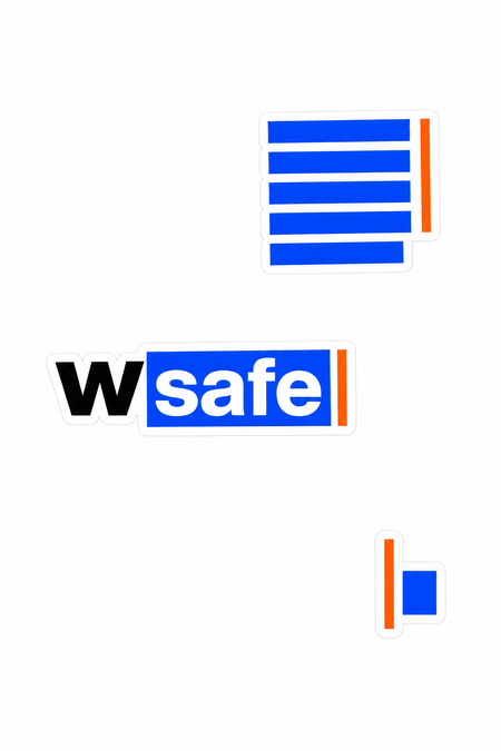
2.Create a photorealistic product mockup of a light-grey iPhone lying face down on a minimalist desk, showcasing a collection of premium Wsafe brand stickers on its back.
Sticker collection: Create a curated set of small, contemporary stickers inspired by Wsafe’s visual identity. Make them feel like real premium vinyl stickers, with crisp edges and a subtle material finish.
Include: Text-selection sticker: Several horizontal vivid electric-blue rectangular highlight bars stacked vertically, resembling selected lines of text on a digital screen. The bars must contain absolutely no text, letters, numbers, or symbols.
Wsafe wordmark sticker: A minimalist black «W» followed by «safe» in white inside a vivid electric-blue rectangular selection highlight, with a thin bright-orange vertical cursor at the right edge.
Minimal technical sticker: A small black-and-white label with a restrained, futuristic graphic treatment, like a piece of equipment labeling, without random or illegible text. Brand colors. Composition: Close-up, three-quarter top-down view, phone as the central subject, all stickers clearly visible and in sharp focus. Neutral grey surroundings, subtle natural texture, realistic proportions, premium commercial photography, high resolution.
Chat gpt
Create a photorealistic minimalist product mockup of a plain white oversized T-shirt hanging on a simple chrome clothing rack in a bright, neutral studio.
Wsafe brand design: Print the slogan «NOT ALL THE HACKERS ARE THE ENEMY.» across the center of the T-shirt in bold black typography. Highlight selected words with vivid electric-blue rectangular text-selection blocks, with white lettering inside the blue areas. Add a thin bright-orange vertical cursor accent at the edge of one highlight. Place a small, discreet black Wsafe wordmark near the upper chest.
Use the brand colors.
Keep the design minimal, contemporary, and typography-driven, like premium independent tech-brand merchandise. Preserve realistic cotton texture, natural fabric folds, soft studio lighting, and subtle shadows. Centered composition, light grey background, vertical 3:4 format.
Chat gpt
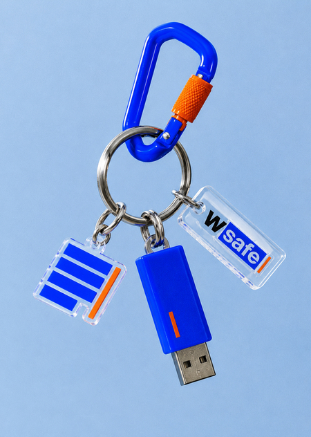
1)Create a photorealistic product photograph of a unique Wsafe cybersecurity brand keychain, suspended against a clean, soft blue background.
The keychain features a polished silver metal ring, a vivid electric-blue carabiner with a small bright-orange locking detail, and several playful, contemporary custom-made charms. Include a small USB flash drive as one of the keychain attachments, with a compact electric-blue casing, a visible metallic USB connector, and a tiny orange graphic accent.
Wsafe visual identity: Use bold electric-blue rectangular text-selection bars, thin orange cursor lines, black typography, and simple geometric shapes inspired by digital interfaces. Include a small transparent acrylic tag with the word «Wsafe» in a minimalist black-and-blue treatment, plus an abstract blue-and-orange selection-inspired charm. Keep the graphics clean and recognizable.
Brand colors. Modern collectible accessory aesthetic, playful but sophisticated, glossy acrylic and molded plastic, realistic brushed metal, subtle reflections, soft studio lighting, close-up composition, slight film grain, premium editorial product photography. Vertical 4:5 format. Make the keychain and USB flash drive clearly visible as separate physical objects attached to the same ring.
2)Create a photorealistic lifestyle mockup of a natural off-white canvas tote bag worn over the shoulder by a casually dressed person in a white oversized T-shirt and dark trousers. The person stands beside a textured beige concrete wall in a modern urban setting, photographed from a close side angle. The tote bag is the main focus.
Design the bag with minimalist. Wsafe brand graphics: several horizontal vivid electric-blue rectangular selection bars stacked vertically, with different lengths and no text inside them. Add a thin bright-orange vertical cursor line at the edge of the blue graphic, plus a small black Wsafe wordmark near the bottom corner.
Brand colors. Make the design look naturally screen-printed onto textured canvas, following the fabric folds and perspective.
Contemporary tech-brand aesthetic, understated streetwear styling, warm natural daylight, realistic materials, editorial fashion photography, vertical 3:4 composition. Keep the tote bag clean and spacious.
Я решила дополнить проект генеративными анимациями, чтобы развить метафору лучше. Их создал Chat gpt