Selected Works
Visual Identity · Branding · Book Design
This presentation is a selection of projects exploring visual identity, branding, and book design — from developing visual systems and their applications to editorial layouts and printed publications.
2023–2026
I’m a communication designer working with visual identity, branding, and editorial design. My practice includes developing identities, applying existing brand systems across different formats, and designing books, from layout to print preparation.
VISUAL IDENTITY & BRANDING
/ Branding for the Museum of Atomic Energy
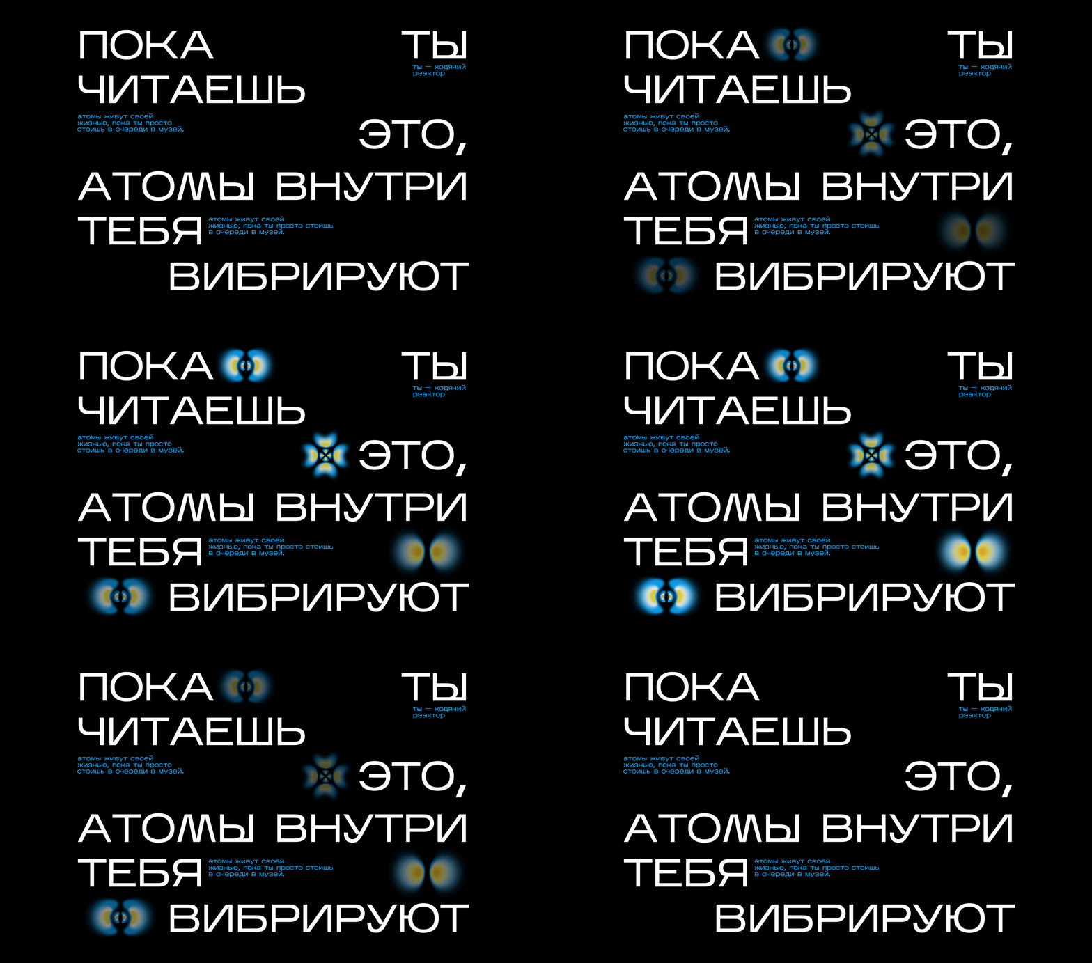
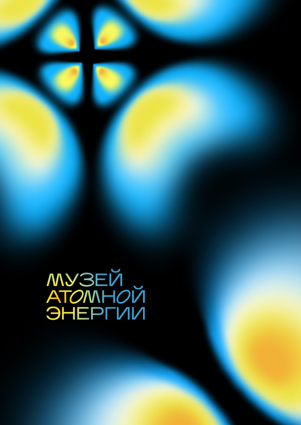
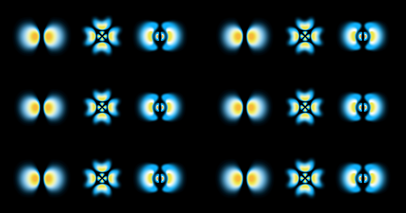
MAKING THE INVISIBLE VISIBLEThe Museum of Atomic Energy is an interactive science and education space dedicated to atomic energy.The visual identity is built around the metaphor of an atom and the distribution of electrons across energy levels. This scientific principle becomes the foundation of the graphic language, translating a complex subject into a recognizable visual system.The identity extends across promotional materials and applications, connecting the museum’s scientific focus with its visual communication.
/ Rebranding for Gorky literature festival
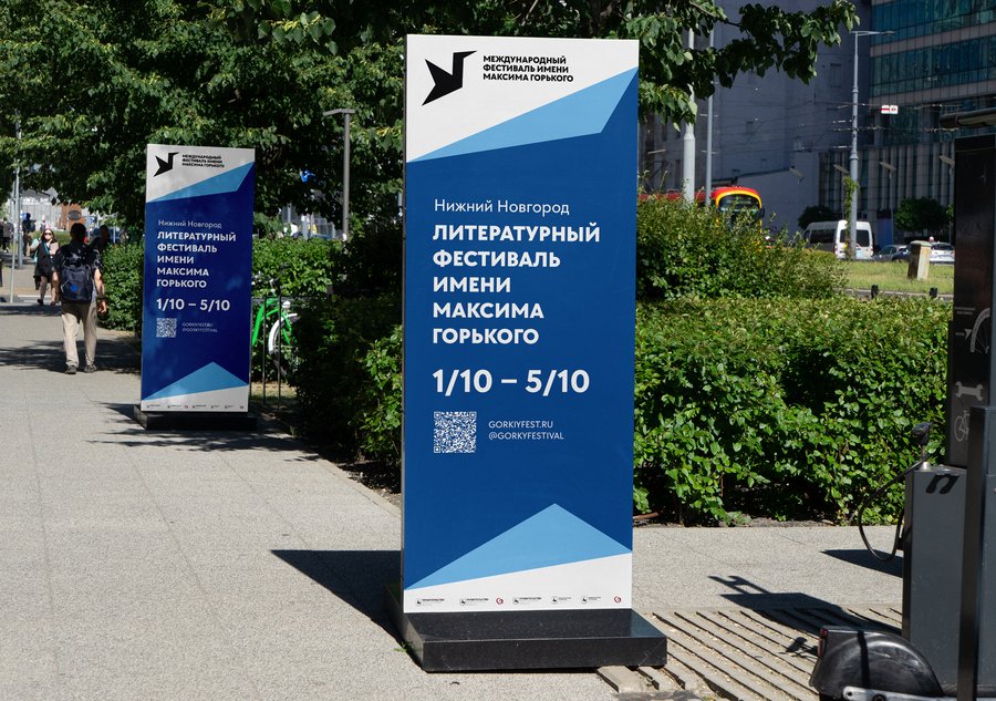

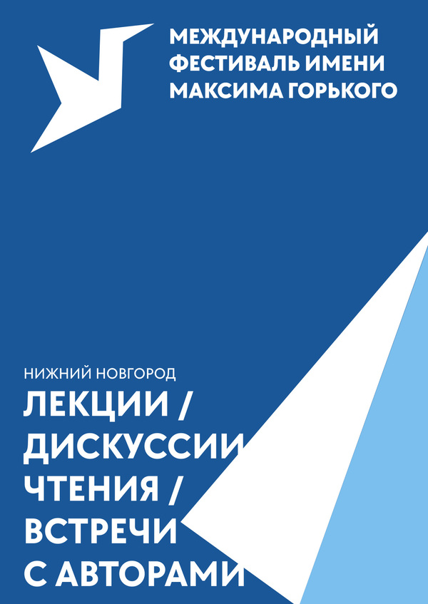
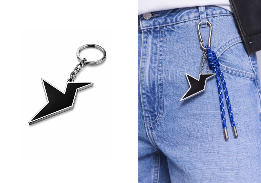
A VISUAL IDENTITY FOR A LITERARY FESTIVALThe project reimagines the visual identity of the Maxim Gorky Literary Festival in Nizhny Novgorod, a cultural event dedicated to literature.The central graphic sign combines an open book with a bird, a recurring image in Gorky’s works. The metaphor of folded pages extends throughout the visual communication, transforming a familiar element of a book into a recognisable graphic motif.The identity is applied across event materials, outdoor signage, and merchandise, maintaining a consistent visual language across different formats.

/ Winter silence
WINTER SILENCE
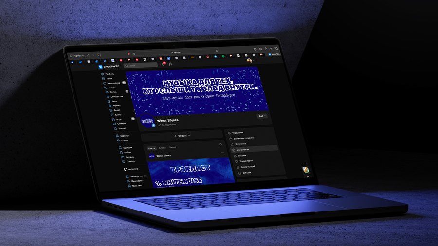
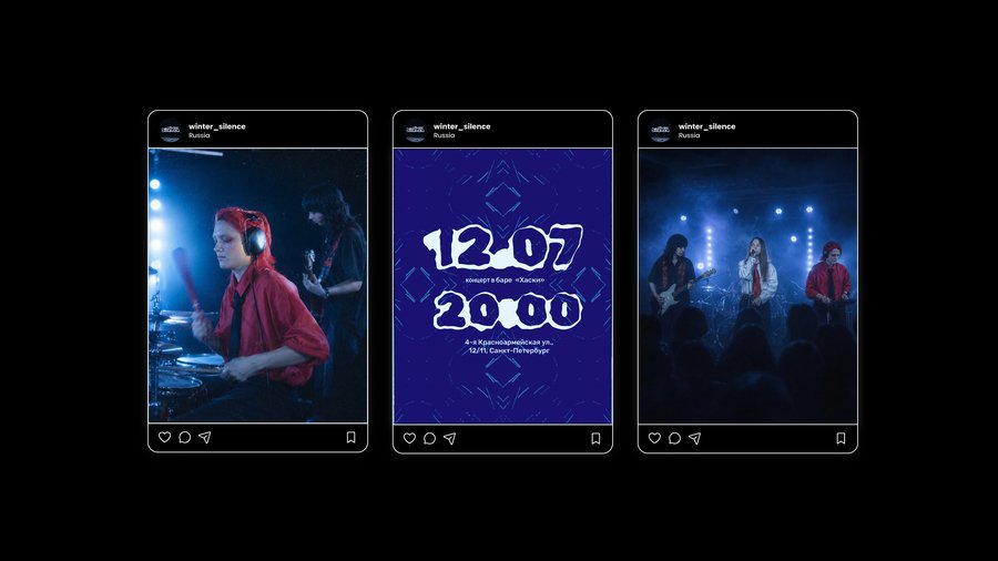
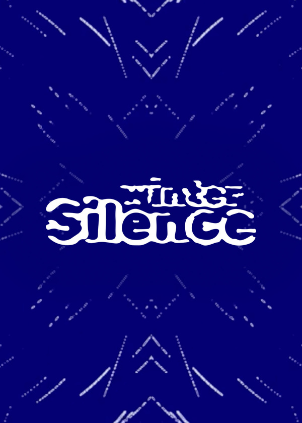
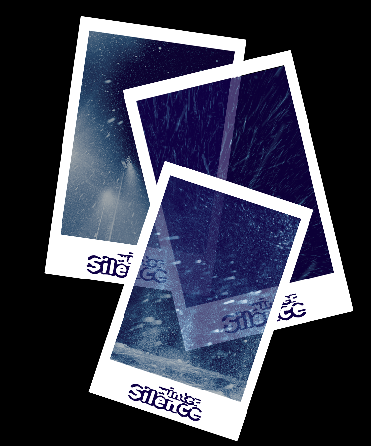
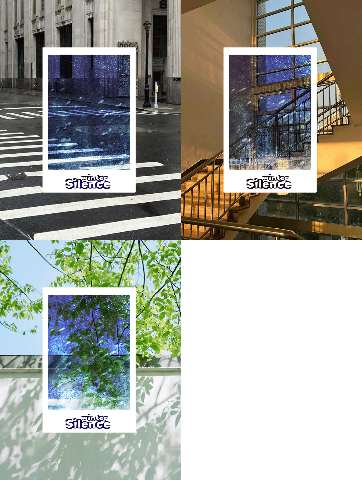
Visual IdentityWinter Silence is an emerging music group from St. Petersburg working at the intersection of alternative metal, indie, and post-rock.The visual identity draws on the imagery of winter and ice. Its central element is a custom-coded tool that distorts the letterforms of a single typeface, turning typography into a flexible graphic element. The distortions evoke the irregular shapes and textures of ice, creating a distinctive visual language.The identity also incorporates symmetrical patterns built from repeating lines and geometric forms. These patterns complement the transformed typography and extend the visual system across a wide range of merchandise, connecting different objects and formats through a consistent graphic style.
BOOK DESIGN
/ Crime (?) and punishment
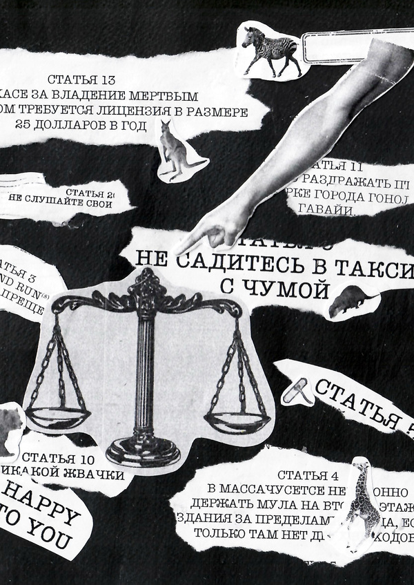
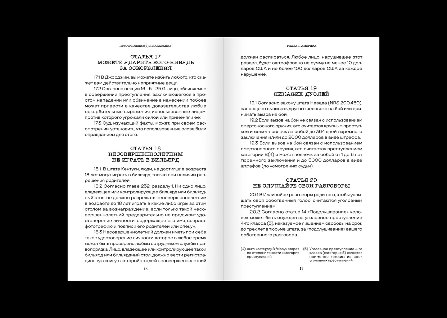
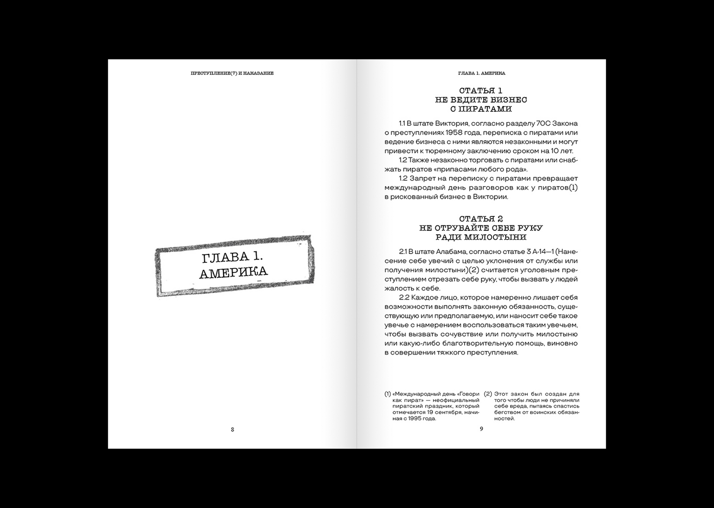
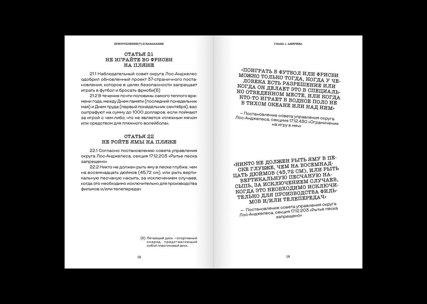
Book SeriesCrime (?) and Punishment is a series of three books exploring unusual laws from different parts of the world. The publication brings together legal curiosities that challenge common sense, revealing the unexpected and sometimes absurd side of legal systems.The layout combines the formal structure of a constitution with the informal character of notes and annotations. This contrast reflects the central idea of the project: laws are official and authoritative, yet their content can sometimes seem irrational or absurd. Torn paper, fragmented text, and a monochrome palette reinforce the tension between the formality of legal documents and the unusual nature of the laws themselves.The question mark in the title disrupts the familiar phrase Crime and Punishment, introducing doubt and reflecting the contradictions explored throughout the series. A consistent approach to typography and layout connects the three volumes into a unified visual system.
/ 134340: The Story of Pluto
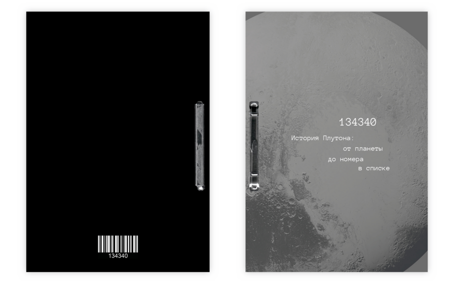
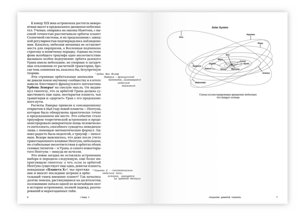
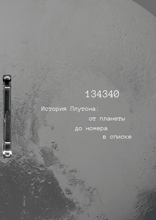
134340 / THE STORY OF PLUTOBook Design134340 tells the story of Pluto, once known as the ninth planet of the Solar System and later reclassified as a dwarf planet. After losing its planetary status, it was assigned the catalogue number 134340.The book draws on the visual language of scientific archives. Its B5 format, positioned between A4 and A5, echoes Pluto’s ambiguous status: it does not fit neatly into the criteria used to define a planet. The cover references archival records, reinforcing the idea of an object reclassified and assigned a new designation.The editorial design combines scientific information and archival references, turning Pluto’s change in status into the central narrative of the book.
/ Can a clown get away with murder?
18+ | Contains mature themes
THE STORY OF JOHN WAYNE GACY
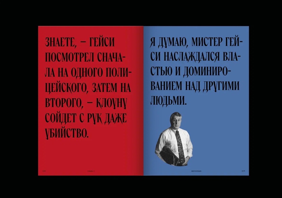
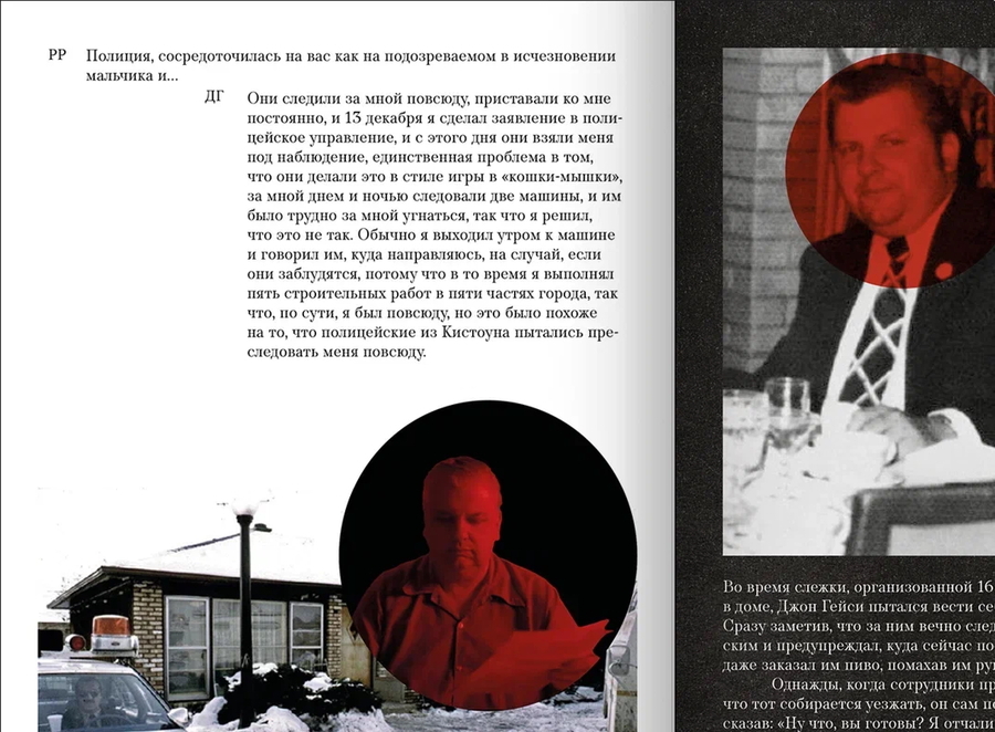
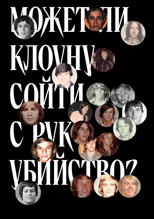
18+ | Contains mature themesA book telling the story of John Wayne Gacy, whose brutality and double life shocked America in the 1970s. His case has often been linked to the inspiration behind Stephen King’s bestselling novel IT, featuring the iconic killer clown. The book is based on an interview Gacy gave to FBI profiler Robert Ressler in 1992.Extensive research into the case and its historical context informed the book’s editorial structure and visual decisions. The design incorporates a colour-coding system to organise the material and establish a consistent visual framework throughout the publication.The circles on the cover reference the spatial arrangement of the bodies discovered beneath Gacy’s house, translating a detail of the case into a graphic element. Together with documentary photographs, archival materials, and typography, this reference connects the visual design directly to the subject matter.The result is an editorial approach in which colour, composition, and imagery are rooted in the details of the case, bringing research and visual storytelling together