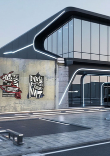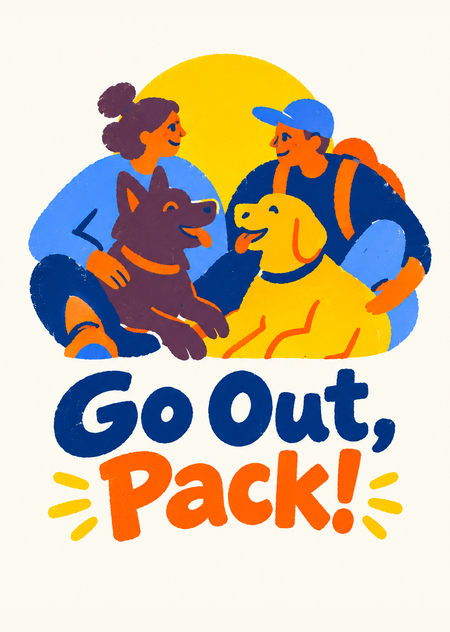
Оригинальный проект «Собака погуляка» был разработкой фирменного стиля для бренда, который организовывал мероприятия для собачников и их собак.
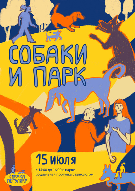
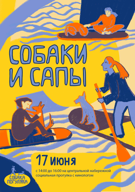
Плакаты из оригинального проекта
Основная идея проекта заключалась в том, что на организованных прогулках не только собаки находят себе друзей, но и люди.
Я решила оставить эту идею основной и развить ее сильнее и разнообразнее с помощью работы с искусственным интеллектом
«Промт для придумывания названия:
Придумай описание для бренда и название для бренда, который организовывает мероприятия для собачников и их собак. Главная миссия бренда, это создание мероприятий на которых друзей должны находить не только собаки, но и их хозяева.»
Я скидывала его в несколько нейросетей, чтобы у меня было больше вариантов, остановилась на том, что мне предложил perplexity — «Go Out, Pack!». Оно показалось мне визуально выразительным и по смыслу подходящим для бренда, который организовывает активный отдых.
«Go Out, Pack!» — это сообщество и сервис мероприятий для собак и их хозяев. Мы создаём прогулки, игры, фестивали, кинологические встречи и городские события, где собаки могут свободно общаться, а люди — легко находить новых друзей.
Наш формат снимает неловкость первого знакомства: общий интерес к собакам становится естественным поводом для разговора. Здесь не просто «вывести собаку погулять» — здесь формируется дружелюбная городская стая, в которой рады и людям, и питомцам.
Миссия: создавать события, на которых друзья находят не только собаки, но и их хозяева.
Я пообщалась с perplexity, чтобы он предложил варианты развития для такого проекта, и с помощью него написала промт на английском для создания логотипа, который загрузила в alice, chatgpt. После некоторых правок, chatgpt выдал логотип, который меня устроил, Логотип и промт находятся ниже
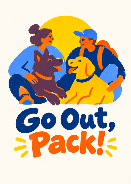
Design a logo for «Go Out, Pack!», a community-driven brand that organizes social events for dogs and their owners.Brand description: Go Out, Pack! brings dogs and their humans together through group walks, outdoor meetups, playdates, and shared adventures. Its central mission is to help people make friends—not just their dogs. The brand should feel welcoming, playful, inclusive, and full of warmth. It is a social community, not a dog-walking or pet-sitting service.Logo concept: Create a compact, memorable emblem featuring two friendly dogs and two human companions coming together as one connected group. Give the humans and dogs equal visual importance to communicate friendship at both ends of the leash. Use overlapping silhouettes and relaxed poses to suggest connection, belonging, and shared outdoor experiences. A simple yellow sun or circular shape may bring the composition together.Reference-inspired visual style: Follow the attached illustration’s playful, hand-painted character. Use bold, flat areas of color; simplified, expressive human and dog silhouettes; organic shapes; and thick, slightly irregular outlines. Add a subtle dry-brush or screen-printed texture while keeping the overall design clean. The palette should combine deep navy blue, periwinkle blue, sunny yellow, vivid orange, and restrained muted-plum accents. Preserve the reference’s lively, imperfect charm, but simplify its dense composition into a clear logo rather than reproducing it as a full illustration.Typography: Include the exact brand name «Go Out, Pack!» in bold, friendly, highly legible custom lettering. Use softly rounded, slightly irregular letterforms that complement the illustrated emblem. Preserve the spelling, capitalization, comma, and exclamation mark exactly.Layout and practical requirements: Present one centered logo on a plain off-white background, with generous negative space and a clear relationship between the emblem and the brand name. Keep the silhouettes recognizable at small sizes. Avoid fine details, excessive texture, gradients, photorealism, 3D effects, drop shadows, and mockup presentations. Do not add any text other than «Go Out, Pack!».Overall feeling: «We came out for a walk and found our people.» Приложила к этому промту иллюстрацию из оригинального проекта.
Неросеть: chatgpt
Промт: Рerplexity
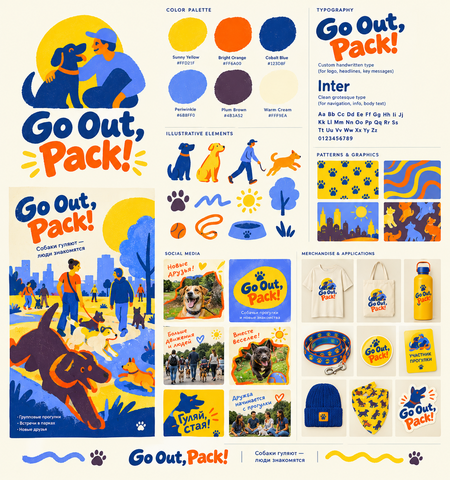
Потом по этому же промту попросила создать брендборд у recraft. Он понадобился мне для дальнейшее работы, чтобы прикладывать его как референс
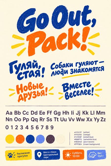
Создала промт на английском через Дипсик для генерации основы типографики. Промт загрузила в чат джипити
Create a typographic composition and font element set for the brand Go Out, Pack! — modern authorial lettering graphics with a printed poster and screen-print effect. The style is energetic, friendly, slightly irregular, and human — without corporate polish.Primary typeface (logo and headlines):— Bold custom handwritten typeface with large, rounded, slightly squashed letters.
— Letters are irregular, «drawn by hand,» with thick strokes and a slight tilt.
— Light texture inside the letters, rough edge and grain effect, as in stencil printing.
— Write the phrase Go Out, Pack! in this style: the word «Go Out,» in cobalt blue (
123D8F), the word «Pack!» in bright orange (
FF6A00).— Around the word «Pack!» add yellow decorative dash-rays on the sides, as in the reference.
— Also write in the same style the Russian words: «Гуляй, стая!», «Собаки гуляют — люди знакомятся», «Новые друзья!», «Вместе веселее!».Secondary typeface (info and navigation):— Clean modern grotesque sans-serif, similar to Inter.
— Show the alphabet: Aa Bb Cc Dd Ee Ff Gg Hh Ii Jj Kk Ll Mm Nn Oo Pp Qq Rr Ss Tt Uu Vv Ww Xx Yy Zz.
— Show numerals: 0123456789.
— Show usage examples: «Расписание прогулок», «Место сбора: Центральный парк», «Суббота, 10:00», «Вес: 150 г».
— Color — dark plum-brown (
4B3A52) or cobalt blue on a warm cream background (
FFF9EA).Palette: sunny yellow (FFD21F), bright orange (
FF6A00), cobalt blue (123D8F), periwinkle blue (
6B8FF0), dark plum-brown (4B3A52), warm cream background (
FFF9EA).Presentation: a typographic specimen sheet on a cream background. Top — the large logo, below — the alphabet in the primary typeface, then — a block with the grotesque and numerals, at the bottom — usage examples as small plaques. Light grain, printed poster effect, uneven edges, high detail.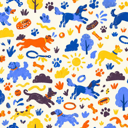
Промт для создания патерна, созданный deepseek, и загруженный в chatgpt:
Create a set of seamless patterns and decorative graphic elements in the brand identity of Go Out, Pack! — modern authorial naive illustration, hand-drawn graphics, printed poster effect with light grain and uneven shape edges. The style is energetic, slightly irregular, and human — without corporate polish.Palette: rich sunny yellow, bright orange, cobalt blue, soft blue-lavender, dark plum-brown, warm cream background. Large contrasting color blocks, bold orange strokes, uneven outlines.Elements for patterns:
Expressive silhouettes of dogs of different breeds and sizes (running, jumping, playing, wagging tails)
Leashes, balls, bowls, collars, bones
Paw prints of various sizes
Tails, curls, wavy route lines
Park trees, bushes, sun, grass in simple shapes
Water splashes, ripples (for the SUP theme)
Irregular plaques, frames, sticker shapes with non-standard geometry
Small decorative elements in the spirit of hand screen printing
Create:
A seamless pattern with dogs and paws on a warm cream background (repeating rapport, varied element scale).
Создание правильного паттерна очень важный этап, в дальнейшем я часто использовала его как референс, чтобы выдерживать единство стиля всего проекта. Еще я использовала его для создания упаковки.
Товары
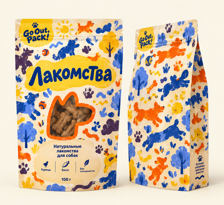
Написала промт через deepseek для создания упаковки с лакомствоми, загрузила его в chatgpt
Промт: Create packaging design for dog treats in the brand identity of Go Out, Pack! — modern authorial naive illustration, hand-drawn graphics, printed poster effect with light grain, uneven shape edges, no corporate polish.Pattern usage: use the attached seamless pattern as the main graphic base of the packaging — wrap it around the pouch body (front, sides, back), preserving the scale and rhythm of the repeat. The pattern must read as continuous, without breaks or distortion at the folds.Packaging format: vertical stand-up pouch (doy-pack) with a zip top, matte kraft or soft cardboard, slightly imperfect «printed» edges.Front composition:Top third — large handwritten word «Лакомства» with irregular expressive letterforms, placed over the pattern on a contrasting irregular-shaped plaque (warm cream or sunny yellow).Go Out, Pack! logo — in the upper corner, legible in one color.Center — a window or sticker with a simple dog silhouette (or snout) in an orange stroke, over the pattern.Bottom third — irregular-shaped plaque with info: «Натуральные лакомства для собак», weight, ingredients.Along the edges — decorative elements: paw prints, wavy route lines, tails.Palette: rich sunny yellow, bright orange, cobalt blue, soft blue-lavender, dark plum-brown, warm cream. Large contrasting blocks, bold orange strokes.Typography: large handwritten typeface for the product name, simple grotesque sans-serif for ingredients, weight, and service info. Text in Russian.Presentation: packaging shown frontally and in a slight ¾ angle on a neutral cream background, soft daylight, light shadow, printed poster effect, light grain, high detail.
попросила chatgpt создать варианты более разнообразного оформление упаковок. Разного цвета фон из фирменного стиля, добавь брелоки в форме собак. Прикрепила картинки типографики и картинку паттерна
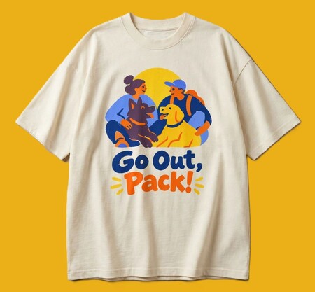
Использовала логотип, который у меня уже был создан, и с помощью playground поместила его на футболку. Он не добавляет ничего лишнего и дает максимально чистый результат.
Брелоки
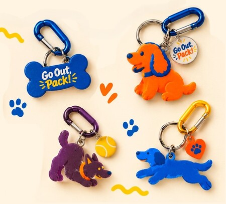
Для создания брелоков написала промт с помощью deepseek, который потом использовала вместе с картинкой сгенерированного паттерна в chatgpt:
Create a mockup photograph of a set of volumetric 3D keychains in the brand identity of Go Out, Pack!. Style strictly based on the reference: authorial naive illustration translated into volume, solid contrasting colors with no gradients, thick orange and blue outlines, soft matte plastic or vinyl (soft vinyl / designer toy).Keychain shape (strictly as requested):— Each keychain is a single volumetric dog figure in a stylized «chibi» style (large head, compact body).
— The figure has one expressive dog head with a snout, two front paws and two back paws (four paws total), and two ears on the head (pointy, floppy, or semi-erect depending on the breed).
— The shape is rounded, smooth, pleasant to the touch, with no sharp corners. The figure stands or sits, conveying a sense of movement and character.Keychain types (different breeds, unified style):1. Husky / Laika — cobalt blue (#123D8F) with a bright orange outline, pointy ears, fluffy tail.
2. Corgi / French Bulldog — sunny yellow (
FFD21F) with a dark plum-brown outline (
4B3A52), big ears, short paws.3. Dachshund / Spaniel — bright orange (#FF6A00) with a cobalt blue outline, long body or floppy ears.Details: On top of each figure’s head — a neat metal ring with a keychain carabiner. On the side of the figure or on a small metal tag — an engraved mini-logo Go Out, Pack!.Presentation: The keychains are arranged on a warm cream background (#FFF9EA) in a lively composition, with brand decorative elements nearby (blue paw prints, wavy lines, stickers). Soft studio overhead lighting, realistic shadows and highlights on the matte surface, macro photography, high detail, soft vinyl texture. Designer art toy effect, light print grain.
Пространства
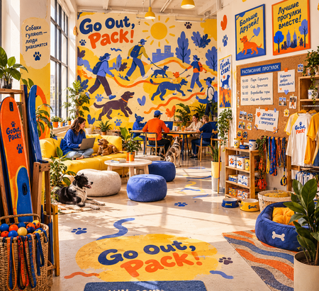
Промт для deepseek: создай промт для описания офиса помещения этого бренда
промт дипсика, которые я загрузила в чат джипити:
Create the office/studio interior of the brand Go Out, Pack! — a space for an urban dog-owner community. Modern urban interior with elements of authorial naive illustration and printed poster aesthetics, energetic, slightly irregular, and human — without corporate polish.Overall feeling: a bright open studio where people work, gather for walks, and connect. A sense of movement, play, friendship, sun, and urban adventure. A dog-friendly space — dogs are genuinely welcome here.
Palette: rich sunny yellow, bright orange, cobalt blue, soft blue-lavender, dark plum-brown, warm cream. Large contrasting color blocks, bold orange accents, uneven outlines.
Walls and graphics:
One wall — a large mural with expressive silhouettes of dogs and people in motion, wavy route lines, paw prints.
Another wall — a gallery of brand posters in irregular-shaped frames, handwritten lettering, large typography.
neven color spots and graphic blocks directly on the walls, printed poster effect, light grain.
A cork or magnetic board with a walk schedule, paw-print stickers, and handwritten notes.
Furniture and objects:
Simple wooden tables and chairs, soft poufs and sofas in cream, yellow, and cobalt.A shelf with merch: T-shirts, leashes, bandanas, stickers, participant cards.
A corner with water bowls, dog beds, and toys.
A basket with balls and leashes by the entrance, a rack with SUP boards.
Potted plants, plenty of natural light from large windows.Details: handwritten signage, paw prints on the floor, wavy route lines on the walls, bright stickers, large color plaques, posters announcing walks. The atmosphere is lively and lived-in — not a sterile showroom.
Light and presentation: soft daylight, warm shadows, light grain, printed poster effect, high detail, viewpoint from the entrance into the depth of the room.
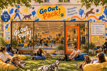
Еще редактировало помещение в chatgpt. Он же мне создал фотографию другого типа помещения, в котором проводили бы тренировки, а снаружи на поляне могли бы отдыхать хозяева с собаками после тренировок, общаться.
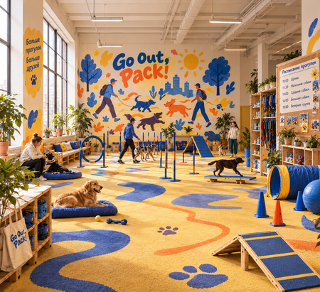
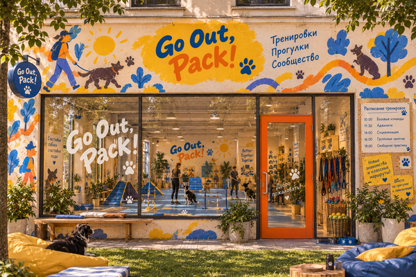
Еще варианты зала для тренировок
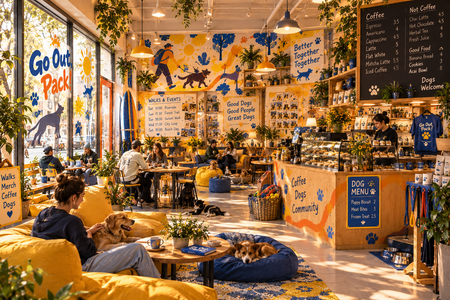
Промт для создания кафе дог-френдли из deepseek, который я потом визуализировала через chatgpt:
Create a dog-friendly cafe interior for the brand Go Out, Pack! — a place to come with dogs for coffee and to gather before walks. A modern urban cafe with elements of authorial naive illustration and printed poster aesthetics, energetic, slightly irregular, and human — without corporate polish.Overall feeling: a warm, lively, welcoming space where people and dogs are equally comfortable. A sense of movement, play, friendship, and urban adventure. At first glance it’s clear: dogs are welcome here.
Palette: rich sunny yellow, bright orange, cobalt blue, soft blue-lavender, dark plum-brown, warm cream. Large contrasting color blocks, bold orange accents, uneven outlines.
Zoning and contents:
Bar counter: a wooden counter with an espresso machine, a display case with dog treats and human cookies, a chalkboard menu with handwritten typography.
Seating area: simple wooden tables and chairs, soft sofas and poufs in cream, yellow, and cobalt, rugs, lots of plants.
Dog zone: dog beds and mats by the tables, water bowls, a leash rack, a toy basket, a «dog menu» on the wall.
Walls: a large mural with expressive silhouettes of dogs and people in motion, wavy route lines, paw prints, uneven color spots; brand posters and walk announcements in irregular-shaped frames, handwritten signage.
Storefront and entrance: large windows with handwritten Go Out, Pack! lettering and dog silhouettes on the glass; by the entrance — water bowls, a bench, a rack with SUP boards and umbrellas.
Details: an irregular-shaped sign, paw-print stickers, garlands, shelves with merch (T-shirts, bandanas, mugs), a board with a walk schedule and photos of dogs.
Light and presentation: soft daylight from large windows plus warm lamps above the counter, warm shadows, light grain, printed poster effect, high detail, viewpoint from the entrance into the depth of the cafe.
Реклама
Промт для баннера, сделанный в deepseek, и загруженный в chatgpt:
Create an urban advertising banner for the brand Go Out, Pack! — a street banner or billboard hanging in the city. Modern urban poster with authorial naive illustration, hand-drawn graphics, large color fields, and light print grain. The style is energetic, slightly irregular, and human — without corporate polish.Overall feeling: a bright banner you want to stop at. A sense of movement, play, friendship, sun, and urban adventure. It’s immediately clear: people with dogs gather here for walks.Palette: rich sunny yellow, bright orange, cobalt blue, soft blue-lavender, dark plum-brown, warm cream. Large contrasting color blocks, bold orange strokes, uneven outlines.Banner composition (horizontal format):Left — a large handwritten headline «Гуляй, стая!» with irregular expressive letterforms on a contrasting irregular-shaped plaque; below it — the Go Out, Pack! logo and a short slogan.Center and right — expressive silhouettes of dogs of different breeds and people in motion: dogs running, jumping, playing, pulling leashes; people walking together, laughing, talking. Overlapping figures, slightly exaggerated poses.Background — large color blocks: sunny-yellow sky, cobalt silhouettes of trees and park paths, wavy route lines, paw prints along the edge.At the bottom — an irregular-shaped plaque with the walk schedule, meeting point, and a QR code, simple grotesque sans-serif for service info.Decorative elements: wavy route lines, paw prints, leashes, tails, irregular plaques and frames, small elements in the spirit of hand screen printing.City presentation: the banner hangs on a building facade or on a stretch banner between poles above the street; around it — urban context: sidewalk, passersby with dogs, trees, soft daylight, warm shadows. Lively and lived-in atmosphere. High detail, printed poster effect, light grain, uneven shape edges.
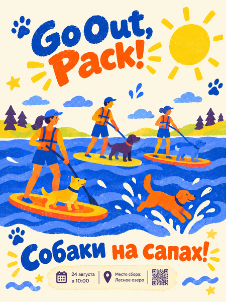
Промт для плаката, созданный deepseek, и загруженный в chatgpt:
Create a vertical advertising poster for the brand Go Out, Pack! , dedicated to a SUP (stand-up paddleboarding) walk with dogs.Overall style: Modern urban poster with a screen-print and gouache effect, light print grain, rough edges, and dense flat colors. Authorial naive illustration, no gradients or corporate gloss.Composition and landscape:Background: A vast expanse of water made of large contrasting blobs: cobalt blue (
123D8F) and soft blue-lavender (
6B8FF0). Stylized wavy lines run across the water (waves, splashes as simple drops and curls). At the top — a large sunny yellow sun (#FFD21F) and flat yellow-green shores with tree silhouettes.Characters (foreground): People (in bright orange life vests and blue shorts) standing on bright orange and yellow SUP boards. Dogs of different breeds (corgi, labrador, mixed breed) in tiny life vests are balancing on the boards with them. Dogs are drawn with thick outlines. One dog is happily jumping off the board into the water, raising graphic splashes. Decorative brand elements float in the air: blue paw prints and yellow stars.Typography: At the top of the poster — a large handwritten Go Out, Pack! logo (the word «Go Out,» in cobalt, «Pack!» in orange with yellow dash-rays). At the bottom — a large handwritten headline «Собаки на сапах!» or «Поймай волну, стая!». Below it — a neat cream irregular-shaped plaque with details: date, time, meeting point, QR code.Presentation: High detail, printed poster effect, rough edges, light grain. A feeling of freshness, summer adventure, splashes, and fun. --ar 3:4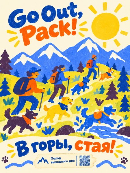
Промт для плаката, созданный deepseek, и загруженный в chatgpt:
Create a vertical advertising poster for the brand Go Out, Pack! , dedicated to a mountain hike with dogs.Overall style: Modern poster with a screen-print and gouache effect, light grain, rough edges, and dense flat colors. Authorial naive illustration, no gradients or corporate gloss.Composition and landscape:Background: Instead of the usual city park — stylized mountains. Large geometric peaks: cobalt blue rocks with white snowy tops, drawn as flat blobs. Above the mountains — a huge sunny yellow sun. Below — yellow-green hills with fir trees (flat dark plum and blue silhouettes). Wavy route lines (trails) lead up the slope.Characters (foreground): A group of people in sportswear (in cobalt and orange jackets) and dogs of different breeds (husky, corgi, mixed breeds) climbing the mountain. Dogs are drawn with thick bright orange or blue outlines. People have backpacks, dogs have tiny backpacks or bandanas. One dog is happily jumping over a stream (water splashes — simple blue drops).Typography: At the top of the poster, right against the sky — a large handwritten Go Out, Pack! logo (the word «Go Out,» in cobalt, «Pack!» in orange with yellow dash-rays). At the bottom — a large handwritten headline «В горы, стая!». Below it — a neat irregular-shaped plaque with details: «Поход выходного дня» and a QR code.Presentation: High detail, printed poster effect, rough edges, light grain. A feeling of freshness, cool mountain air, adventure, and friendship. --ar 3:4