CONCEPT

The album cover is the listener’s first visual encounter with the music, occurring even before the first note plays. For over half a century, it served not a decorative but a communicative function: it shaped expectations, established the «protocol of perception» for the album, and acted as a visual argument in favor of listening.
However, between the 1970s and the 2020s, the physical music medium changed three times—the vinyl record gave way to the compact disc, which was then superseded by digital streaming. Each of these transitions presented designers with new challenges and demanded new strategies.
The problem this research aims to address is that existing literature either describes covers as a history of styles or analyzes them as cultural artifacts divorced from the physical medium. Insufficiently studied is how the shift in medium specifically transformed design strategies and the function of the cover—and what remained constant throughout that process.
Key research question:
How has the shift in material media transformed design strategies for album covers and their function in shaping listener expectations of music?
The cover throughout the entire period under consideration served as a «perceptual navigator»: it helped the listener enter the world of the album and distinguish it from others. However, while this function was realized through physical space and tactility on vinyl (such as Andy Warhol’s zipper on Sticky Fingers by The Rolling Stones), in the CD era it was realized through concentration and symbolism, because the compressed format demanded a concise, instantly readable image, and in the streaming era—through instant visual recognizability in a thumbnail. Designers were solving specific communication challenges: capturing attention in a store, creating an art object, or ensuring screen legibility. Despite this, the essential point remains constant: the cover is still the primary visual argument for listening.
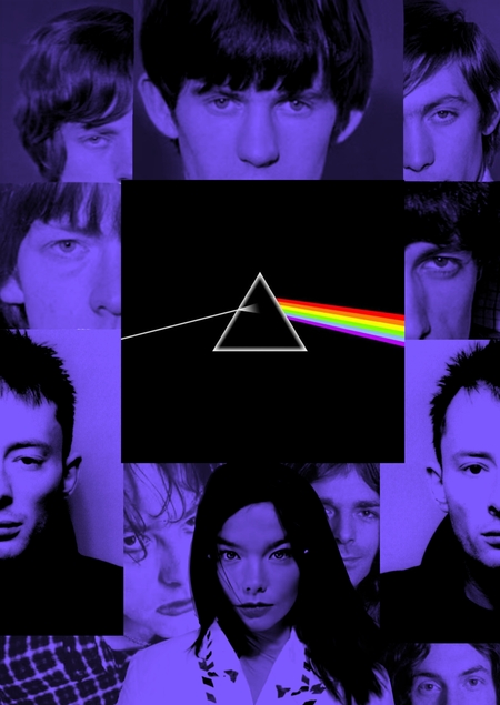
For a comprehensive comparison, three artists or groups were selected whose careers span multiple formats, and whose album covers are widely considered iconic. Pink Floyd (1973–2014) represents the benchmark for the «vinyl» approach: the Hipgnosis covers (Storm Thorgerson) functioned as autonomous conceptual objects that required physical examination (The Dark Side of the Moon, 1973; Wish You Were Here, 1975). Radiohead (1995–2016) serves as a transitional case: their collaboration with Stanley Donwood began during the CD era and continued into digital, with the covers for Kid A (2000) and In Rainbows (2007) demonstrating how design responded to format compression and changes in distribution models. Björk (1997–2015) is an example of «total design»: beginning with Homogenic (1997), she collaborated with Alexander McQueen and Nick Knight, transforming the cover into part of a unified visual statement—Biophilia (2011) is an example, as it was the first «app-album» where the cover functions as an interface. A contrasting case is The Rolling Stones (Sticky Fingers, 1971): the zipper-covered album art is an example of tactile provocation, something physically impossible in a digital format, which vividly illustrates the loss of the cover’s «corporeality» during the shift to streaming.
The research structure includes five chapters. The first chapter establishes the theoretical framework. The second chapter is dedicated to the vinyl era (1970s): the cover as an art object and a physical experience. The third chapter addresses the CD era and transitional period (1980s–2000s): format compression and the conceptualization of design. The fourth chapter covers the streaming era (2010s–2020s): the cover as an icon and interface, informed by research data on cover perception on screens. The fifth chapter is a comparative analysis: what has changed and what has remained constant.