What is this project about?
In the modern world, where consumer culture is increasingly focused on mindfulness, health, and emotional well-being, brands are faced with the necessity not just to offer a product but to build a deep, multifaceted communication with their audience. This task is particularly urgent in the category of products traditionally regarded as «pleasure» items, such as ice cream.
My project is dedicated to developing a communication strategy for a new ice cream brand called «Calrabbi» — a product created exclusively from skimmed milk and dry yogurt, free of sugar, and intended both for people with health limitations and for those leading an active, conscious lifestyle.
This strategy involves understanding the values and expectations of the target audience, emphasizing the product’s health benefits, natural composition, and suitability for a mindful lifestyle. Key messages should highlight the product’s unique composition, its focus on health without compromising on taste, and its alignment with modern consumers’ desire for transparency and wellness.
The goal of the project is not simply to describe the brand, but to demonstrate how communication theory can be integrated into design practice to solve a specific marketing and emotional problem: to help adults once again experience the joy of ice cream — that same childhood joy — without worrying about the product’s ingredients.
Key brand values
The formula contains only two ingredients — dry milk and dry yogurt. No sugar, colorings, or stabilizers. Just honesty.
The taste, texture and presentation recreate the feeling of childhood ice cream and a sense of nostalgia.
The brand understands the consumer’s internal conflict and offers its resolution with empathy and care.
The Calrabbi brand positions itself as an ice cream you can fall in love with twice: as a child for the taste, and as an adult for the ingredients. This isn’t a diet product in the traditional sense, but a return to joy.
The target audience is adults aged 25 to 45 who lead a mindful lifestyle: those with diabetes, those on a low-carb diet, fitness enthusiasts, and parents looking for a safe treat for the whole family. For them, the key is not just «healthy,» but the opportunity to indulge in pleasures.
The main communication message is:
«Remember eating ice cream as a kid? Without worrying about calories or worrying about the ingredients? Calrabbi brings that feeling back—without the sugar, but with the same delicious taste of happiness.»
This message is based on emotional memory theory. Visual and taste cues activate positive memories, while honest ingredients build trust through transparent communication. Thus, the brand doesn’t simply inform — it engages the consumer in an emotional narrative.
The design of the «Calrabbi» brand as a narrative
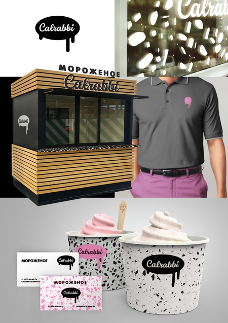
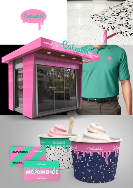
Collages of design solutions
Logo
Logo «Calrabbi»
The logo features the word «Calrabbi» in a stylized form, placed in a bubble resembling a drop of ice cream. The drop shape is a universal symbol of sweetness, liquidity, and pleasure. The flowing drop creates a feeling of freshness, softness, and fluidity, which is associated with the quality of the product.
Black on a white background is a contrast that works even on a small scale, such as a business card or a T-shirt badge. One version shows how this symbol adapts to different color palettes while maintaining recognizability — which aligns with the theory of modularity in branding, which posits that a brand should be flexible yet always recognizable.
Kiosk
Kiosk design variations
Monochrome is used in the first version of the kiosk and packaging. Black, white, and natural wood tones predominate. This is a functional code: minimalism, purity, and medical precision. The black and white terracotta texture on the packaging and kiosk countertop hints at the «purity» and «safety» of the ingredients, as well as a modern, trendy style.
In the second version of the kiosk and packaging, the colors become more cheerful — bright pink, rich mint, and blue. This is an emotional code: childhood, joy, play. The color blocks on the business cards and packaging — pink and mint diagonals, multicolored terracotta patterns — work as visual triggers of nostalgia, activating memories of brightly colored childhood ice creams.
Thus, the brand utilizes Umberto Eco’s dual code: seriousness and honesty on the one hand, and fun and nostalgia on the other. This isn’t a random combination, but a deliberate strategy based on the theory of cognitive dissonance: consumers see the contradiction between «healthy» and «bright,» and their brain searches for a resolution — and finds it in the idea: «This ice cream is for me, an adult who wants to enjoy guilt-free.»
In the first version, the kiosk looks like a modern shop, while in the second, it resembles a toy house, emphasizing the transition from «adult» to «childish» perception. This is a visual narrative: the consumer arrives at the point of sale as an adult and leaves as a child who has received a gift.
Uniform
The staff uniform is a gray or mint-green polo shirt with a miniature teardrop logo on the chest. This is a crucial element of the visual narrative: the staff becomes part of the story. Their clothing is more than just a uniform, but a visual signal of trust. Gray signifies neutrality and professionalism; mint signifies freshness and health; and the pink teardrop is a reminder of the brand’s core value — joy.
Business cards
The business cards are available in two versions: monochrome and color. Both use the same logo, font, and colors. This exemplifies consistency, a crucial principle in branding. The card not only features the name and contact information, but also the keyword «ICE CREAM» — a reminder of the product’s essence, even in thumbnail form.
Colored business cards with diagonal stripes create a visual accent that attracts attention without disrupting the overall design. They act as visual marks — when someone sees one, they instantly recall the brand.
Product and packaging