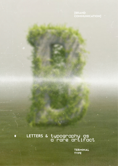

About Terminal Type Foundry (TTF)
Human communication is built on signs and symbols that encode meaning within a cultural context. They can be direct and functional or complex and layered, carrying the weight of history, identity, and collective memory.
Terminal Type Foundry (TTF) is a digital type foundry dedicated to the revival and evolution of the Cyrillic script. It is a company built on the principle that type design is not just a technical craft but a vital form of cultural communication, bridging heritage and innovation through purposeful design.
Does the visual language of your project feel generic, lacking a distinctive voice? Does your brand struggle to connect with an audience on a cultural level, relying on borrowed aesthetic codes? Do you seek tools that carry not just function, but meaning and historical resonance? Our foundry helps brands and creators articulate their unique identity. We are based on designing typefaces that are methodologically sound, culturally significant, and technically flawless, transforming abstract values into tangible visual form.
Communication theory in the field of design
Communication theory in design examines how visual elements—form, space, color, and, most critically, typography—act as carriers of meaning, shaping perception and guiding interpretation. It deconstructs the message into its core components: the sender (the designer/foundry), the receiver (the user, reader, or client), the signs and codes employed (glyphs, stylistic sets, visual metaphors), and the channel of delivery (screen, print, environment). Crucially, it emphasizes how context—cultural, historical, and medium-specific—fundamentally determines decoding.
For TTF, communication theory is not ancillary; it is the foundational methodology. We operate at the intersection of multiple theoretical frameworks:
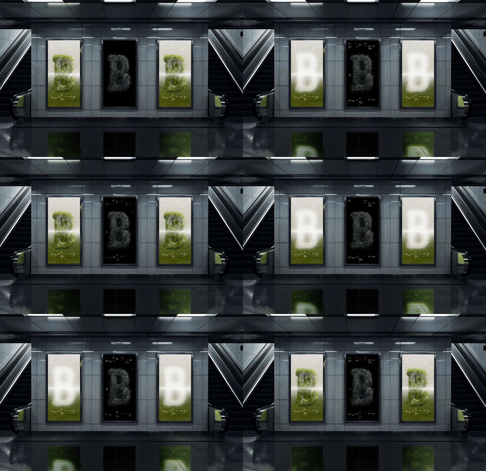
Digital banners with the main KV
Semiotics (The Science of Signs): Every letterform is a sign. Its stroke modulation, contrast, serif form, and proportions generate meaning. A monospaced glyph whispers «code» and «system»; a calligraphic flourish suggests «heritage» and «craft.» We use semiotics to engineer fonts where each stylistic decision is a deliberate semantic choice.
Rhetorical Tradition (Aristotle’s Ethos, Pathos, Logos): A typeface is an argument. Ethos (credibility) is built through technical perfection, historical research, and our association with Terminal Design. Pathos (emotional connection) is evoked through the nostalgia of an «artifact» or the sleekness of a «digital future.» Logos (logic) is presented in the font’s functionality, its extensive character set, and its seamless performance across media.
Decorative roll-ups with graphics
The Elaboration Likelihood Model (ELM): We craft dual communication paths. For the professional designer (central route), we provide deep documentation on technical specs, optical corrections, and design rationale. For the broader business client (peripheral route), we communicate through powerful visual metaphors, narrative about cultural code, and the immediate aesthetic impact of the typeface.
Thus, our design transcends aesthetics. It is a disciplined application of theory to create tools that are not only beautiful but are semantically rich, rhetorically persuasive, and contextually aware, capable of building profound connections between a brand and its audience.
Advertising banner for the TTF event 1
Presentation for a General Audience
In an era of visual noise and generic templates, how does a brand find its true, unmistakable voice? How do you communicate values like heritage, innovation, or authenticity not just with words, but in the very texture of your visual presence?
Advertising banner for the TTF event 2
— Meet Terminal Type Foundry. Where letters are not just set, but spoken.
The challenge is not a lack of fonts, but a lack of meaning. Standard typefaces offer function, but often lack soul, history, or a point of connection deeper than mere trendiness.
A brand needs more than legibility; it needs character, resonance, and a visual language that feels intrinsically its own.
TTF website design with animation
That’s why we created TTF. We are more than a font library; we are archaeologists and architects of the Cyrillic script. We excavate its historical forms and reconstruct them for the digital landscape, creating tools that are both timeless and timely.
Our process does not involve simply drawing letters. We conduct a deep analysis of cultural context, brand essence, and communicative goals. We build typographic systems that are tailored to your specific narrative, ensuring every headline, every paragraph, reinforces who you are.
SMM design
That’s why we created TTF. We are more than a font library; we are archaeologists and architects of the Cyrillic script. We excavate its historical forms and reconstruct them for the digital landscape, creating tools that are both timeless and timely.
Our process does not involve simply drawing letters. We conduct a deep analysis of cultural context, brand essence, and communicative goals. We build typographic systems that are tailored to your specific narrative, ensuring every headline, every paragraph, reinforces who you are.
And because every story is unique, we create fonts that, while part of a coherent foundry style, possess distinct personalities—from the robust confidence of a display face to the subtle intelligence of a text font.
So, what does TTF offer? The answer is foundational.
Your Guide to the World of Cyrillic. A curated catalogue of retail fonts, each with a documented story and a defined role, from expressive display artifacts to workhorse text families.
A Physical Philosophy in a Digital World. Our identity extends into physical artifacts and spaces. The design of our specimens, publications, and spaces reflects our core metaphor: the fusion of archival precision and digital fluidity.
A Partnership in Craft. For bespoke projects, we become an extension of your team. We translate your brand’s ethos into a unique typographic voice, crafting a proprietary asset that becomes a cornerstone of your identity.
Tif identity (design of branded letterheads, envelopes)
Presentation for a Professional Audience
The TTF identity system is built on a deliberate tension between stark, systematic clarity and evocative, artifact-like texture. The primary color framework is black and white, establishing a canvas of absolute contrast, precision, and focus—a direct reference to the binary nature of digital creation and the traditional print specimen. This is not neutrality for comfort, but neutrality for emphasis, forcing attention onto the form and detail of the letter itself.
Catalog cover design
Accentuating this framework are controlled bursts of digital green (inspired by monochrome terminals) and archival hues (like faded blueprint or parchment tones). These are not decorative; they are semantic. Green signals «code,» «system,» and «live process.» The archival tones signal «artifact,» «history,» and «reference.»
Catalog design
Visual harmony is achieved not through soothing palettes, but through rigorous geometric grids and a consistent treatment of visual «noise.» Intentional glitches, data-moshing effects, and layered transparency mimic digital corruption and archival decay, embedding our core metaphor of «past/future» directly into the visual texture. This controlled chaos is always contained within a severe, structured layout, embodying the foundry’s methodical approach.
Brand identity carrier (badge)
The identity is a fully integrated system:
Typography: The logotype itself demonstrates our philosophy, often combining a monospaced, structural base with unexpected calligraphic or distorted elements. For running text, we use our own or meticulously selected grotesques that echo the same precision.
Imagery: Original visuals dominate: hyper-detailed macro shots of letterpress glyphs, 3D-rendered letters as archaeological objects, and UI fragments from custom font-design tools we imagine.
Physical Touchpoints: Specimen booklets use specialty papers—some crisp and modern, others textured and archival. Foil stamping in metallic or muted green reinforces the artifact quality. Business cards are minimal data cards.
Digital Experience: The website UI treats type specimens as interactive artifacts. Users can toggle between «pristine» and «degraded» views of a font, adjust glitch parameters, or see glyphs presented as pieces of a debugging screen. The shopping cart / license portal is styled as a terminal interface.
We collaborate not just with designers, but with historians, linguists, and software developers. Our products are not merely fonts but typedesign systems: each release includes:
Variable Fonts with axes for weight, width, and often a custom «artifact» axis (smooth-to-degraded).



