Contents
i. What is ABC Dinamo ii. Communication channels iii. Analysis iv. Conclusion v. Sources
i. What is ABC Dinamo

Logotype of ABC Dinamo
ABC Dinamo (operating as Dinamo Typefaces) is an independent type design studio headquartered in Berlin, Germany. Founded in 2013 by Johannes Breyer and Fabian Harb, the studio develops retail and bespoke typefaces, design software, research publications, and physical objects. Dinamo positions itself at the intersection of graphic design, cultural production, and technology.
In 2016, Dinamo received the Swiss Design Award, just three years after its founding — an unusually rapid recognition for a young independent type foundry. Since 2018, its co-founders have been members of the Alliance Graphique Internationale (AGI), further underscoring the studio’s reputation within the international design community.
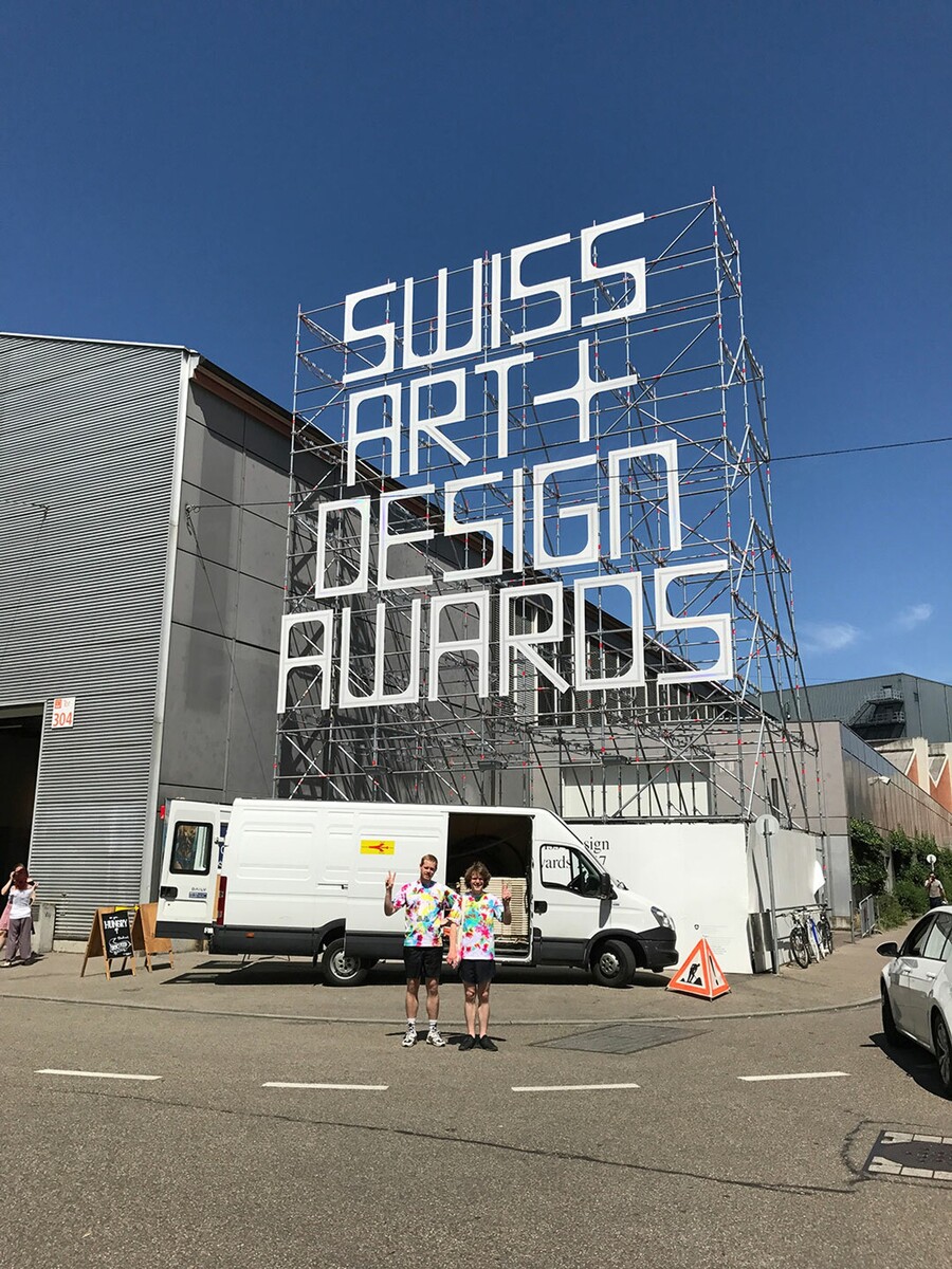
ABC Dinamo at Swiss Design Awards, 2016
Core Brand Positioning
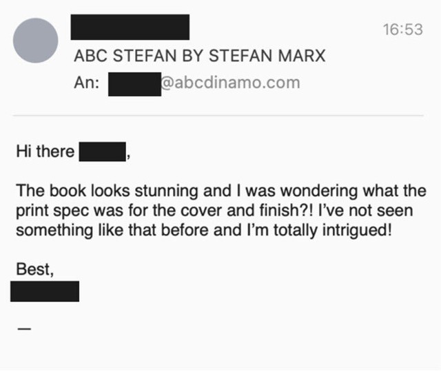
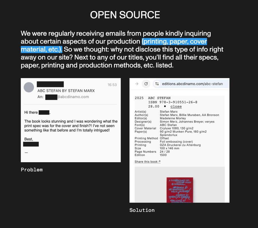
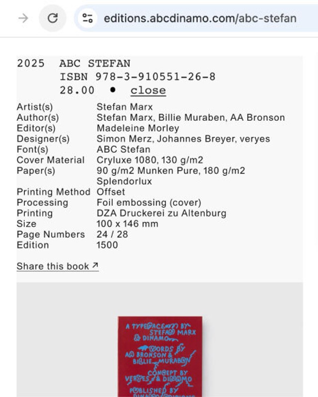
Example of ABC Dinamo being open to changes for people’s comfort
Hybrid Innovation: The studio emphasizes technological experimentation. For example, its flagship typeface Arizona (2021) was among the first to bring together multiple font styles (Serif, Sans, Flare, Mix, and Text) in a single variable font file
Cultural Independence: Dinamo positions itself as a designer-led, independent studio, not a corporate foundry. This is underlined by its basement publishing imprint, self-produced radio show, and non-commercial collaborations with artists.
Fair & Transparent Commerce: In 2020, Dinamo was the first foundry to adopt value-based pricing, scaling font costs to company size. It offers 25% discounts to cultural projects and special student programs.
Slide from ABC Dinamo presentation on typeface pricing.
Target audience
Primary: a) Graphic designers and type directors working in independent studios, agencies, and in-house creative teams b) Students of graphic design and typography (served through dedicated student programs and classroom licenses).
Secondary: Artists, musicians, and cultural producers, and collaborators.
Meme created by ABC Dinamo
ii. Communication Channels
Digital Communication Channels
ABC Dinamo official website
Website (abcdinamo.com): The website is the primary commercial hub and editorial voice of the brand. It combines an e-commerce store (font licensing), a font customizer tool, a blog, a newsletter archive, case studies (client work), and an events section. The tone of website is casual but authoritative.
Instagram* (@abcdinamo): The studio’s Instagram functions as a visual portfolio and announcement platform. Posts range from typeface animations and campaign imagery to behind-the-scenes studio life and cultural commentary.
Newsletter (The Dinamo Update): A semi-regular email newsletter that provides product announcements with cultural essays, studio gossips, tutorials, and opinions. It functions as a high-trust direct channel to the most engaged segment of audience.
*Instagram is owned by Meta, which is recognized as an extremist organization in Russia.
PR & Communication Strategies
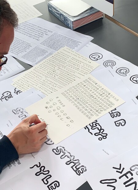
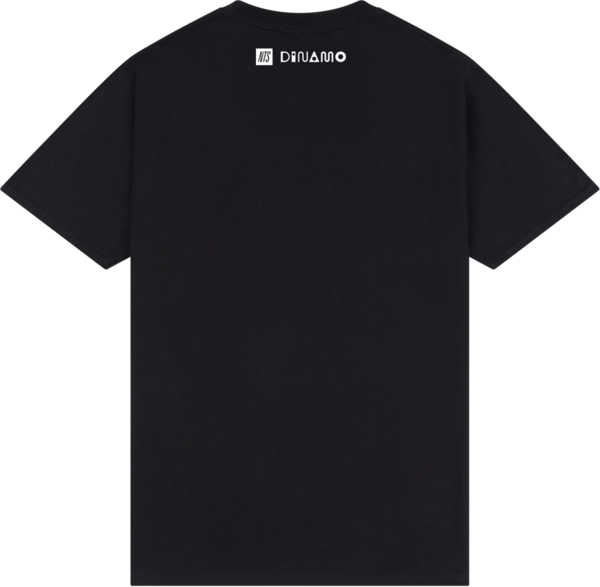
ABC Stepfan typeface in process (collaboration with Stefan Marx) // NTS radio & ABC Dinamo Campaign
Guest Takeovers: Dinamo regularly invites external writers, artists, and critics to publish essays on the brand’s blog. Contributers have included art critic Silvio Lorusso (on «Serif Populism»), cultural journalist Whitney Mallett, and editor Elise By Olsen. This positions Dinamo as a cultural platform, not merely a commerce site.
Collaborations: The Arizona Compressed campaign (2026) with DJ horsegiirL represents Dinamo’s first printed out-of-home PR campaign. Arizona billboards and posters were placed in Berlin, London, and New York. The collaboration was documented in a full newsletter and created a behind-the-scenes PR narrative.
Media & Radio Presence: The studio produces fonts, an ongoing music show on London’s NTS Radio, spanning post-rock, ambient and dream pop. It extends the brand’s cultural presence into the music world and reaches audiences far beyond the type design community.
iii. Analysis
Visual mascots by ABC Dinamo
ELM Analysis of the Central Route for Expert Audiences
To capture the complexity of ABC Dinamo’s communication strategy, we apply two complementary theoretical lenses: The Elaboration Likelihood Model (ELM) and Dialogic Theory of PR. Dinamo targets motivated, knowledgeable audiences through content requiring deep cognitive elaboration:
Articles such as «Using Variable Fonts on the Web», «A Guide to OpenType Features» and «Managing Multiscript Typefaces with Just One File» are detailed, argument-rich pieces. They provide strong informational arguments that drive durable attitude change toward Dinamo as an authoritative technical partner.
The essay «How Does Dinamo Price Fonts?» presents a full rationale for value-based licensing — a substantive argument aimed at professional buyers who critically evaluate font purchasing decisions. This is a textbook central-route strategy: detailed data, logical structure, addressing counter-arguments.
Publishing an annual report with financial and community data is an extraordinary level of transparency for a design studio. This appeals to the type of audience that scrutinizes business models, designers and design educators considering Dinamo as both a vendor and a professional model.
ELM Analysis: Biased vs. Objective Elaboration
Research in collaboration with Silvio Lorusso at ABC Dinamo website
Biased Elaboration (Top-Down): Griffin (2009) defines biased elaboration as thinking in which predetermined conclusions color the supporting data. Dinamo’s newsletter and guest essay content is often structured around a specific cultural-critical premise. For example, Silvio Lorusso’s guest essay «Serif Populism» presents a pre-formed cultural argument and uses font aesthetics as evidence; a form of biased elaboration Dinamo platforms deliberately to associate its brand with intellectual credibility.
Objective Elaboration (Bottom-Up): In contrast, technical content, such as font tutorials, pricing breakdowns, OpenType feature guides encourages objective elaboration: the reader is invited to evaluate facts without predetermined conclusions. This dual mode is strategically coherent. Biased elaboration in cultural or campaign content builds emotional affinity and brand identity.
Pricing options on ABC Dinamo retail typefaces
Dialogic Theory Analysis: The Dialogic Loop
Kent & Taylor’s (1998) most critical principle is the dialogic loop, meaning the organization’s ability and willingness to respond to audience messages. This is where many brands fail because they broadcast without listening. Here is an evidence of dialogic loop activity at Dinamo:
Surveys: The studio published a «Money and Emotion» survey asking the creative community about their feelings toward design economics and later published the results. This creates a genuine feedback loop rather than a one-way declaration.
Guest contribution invitation: The website invites external writers to contribute guest essays with the phrase «Interested in contributing? Please get in touch!» This turns the audience from passive receivers into active participants.



