Longread translated automatically

Romance of the Future — an exhibition of the future’s romantic relationships

For the project’s idenostics, the Future Romance font was developed, based on a synthesis of the feelings of love and calculus of the AI. Artificial unpredictability becomes the basis of the drawing.

big
Original size 1800x1024
big
Original size 1800x1024
big
Original size 1800x1024

The variability of the font makes it possible to be sharp, irritable, excited, nervous, excited, and in love at the same time. As a starting point for the Future Romance font, one of the drawings of TT Geekette Studio TypeType was selected. We helped him feel in love by giving him a new sound and architectural form.

Is love between man and artificial intelligence possible? Is this relationship perfectly programmed, or is it passionately unpredictable? What’s that? System failure or a real surge of feelings? All these questions are answered by Romance of the Future.
Original size 1800x1024
Romance of the Future exhibit
Ксения Овчинникова создала айдентику выставки Romance Of The Future, исследующей романтические отношения будущего. Шрифт Future Romance, разработанный для проекта, сочетает в себе чувства любви и расчетливости ИИ через вариативное начертание.
Project description created with AI
1867
Project created at 21.02.2023
More projects in identity & branding
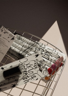
Алиса Игнатьева создала упаковку для маркеров Sketch&Scratch, которая сочетает в себе стиль и функциональность. Дизайн отсылает к исписанному стеклянному офисному аквариуму и уличным тегам, подчеркивая креативность использования маркеров.
Анна Хромова создала логотип и фирменный стиль для академии электронной музыки Resonance. Проект включает динамичный и вариативный логотип с несколькими разновидностями, отражающими направления деятельности академии.
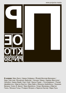
Митя Харшак подготовил 30-й номер журнала «Projector», посвящённый истории швейцарского дизайна и его ключевым фигурам. В выпуске подробно рассказано о влиянии книги Эмиля Рудера «Typography» на современное графическое искусство и представлены работы участников выставки «Swiss Made».
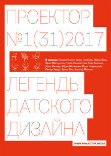
Митя Харшак подготовил 31-й номер журнала «Projector», посвящённый истории датского дизайна и сотрудничеству с музеями. В выпуске представлены статьи, в которых обсуждаются работы таких дизайнеров, как Kaare Klint, Arne Jacobsen и Hans Wegner, с участием редактора Pavel Ulyanov.
We use cookies to improve the operation of the HSE website and to enhance its usability. More detailed information on the use of cookies can be fou...
Show more